The iconic Warner Bros. shield is changing again. This time, the redesign anticipates the revision for the whole WB brand family.
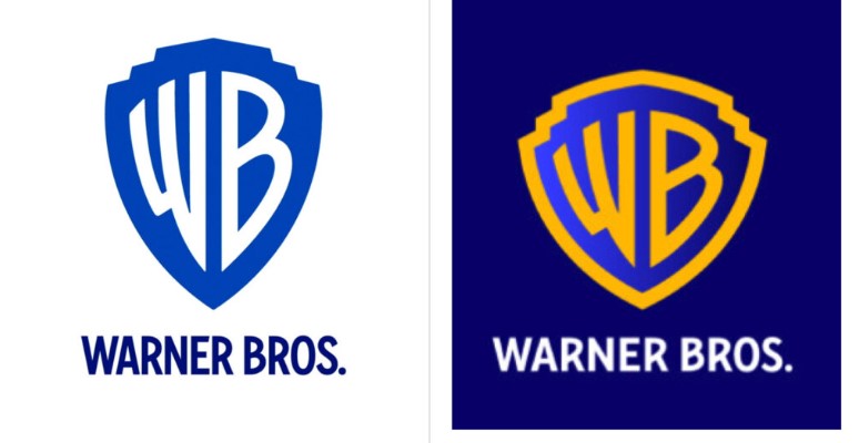
The new version of the Warner Bros. logo certainly keeps its general design. Compared to the 2019 iteration, it has received thicker lines for the bordering and the “WB” which has remarkably become wider. And these adjustments add some clarity to the famous emblem.

While the previous design was developed by Pentagram just three years ago, the current rebranding has been carried out by the design agency Chermayeff & Geismar & Haviv. The logo update won’t seem so surprising though if we remember that the movie giant is celebrating its centenary this year.
Back in 2019, the total debt of AT&T, Warner Media’s owner, was enormous. The company was revising its business portfolio, with the emerging HBO and MAX. And about that time, the studio announced that it was cooperating with Pentagram to make the Warner Bros. logo sleeker and more modern ahead of its centenary in 2023.

In this regard, Pentagram’s version demonstrated a considerable change in design, including an altered shape of the WB shield which became visibly flatter. However, the problem was that 89% spoke in favor of the old logo, according to a survey published by the Visual Objects website. For many, the original WB logo is the thing they associate the entertainment studio with, evoking memories. For whatever reason, the Pentagram-made emblem appeared not so popular among Warner Bros. fans.
So, the new version is intended not only to rebuild the brand’s architecture but also to modify the WB shield to bring back its classic heritage. Featuring a bold bordering in yellow, the logo looks less stretched, which is more consistent with the 1984 design.

On the other hand, regardless of the flat design, we can see some attenuation of blue that gives the logo a certain dimensionality. The Warner Bros. lettering below the shield can be named a successful solution too as the typography was revised with balanced proportions, and hence, better readability.


