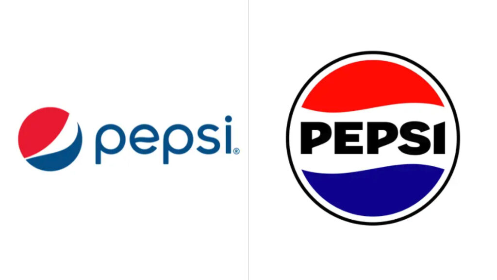
The iconic soft drink brand Pepsi has updated its logo, bringing back the classic design the company had before it introduced the “paunchy” symbol in 2008. The fresh structure again has an all-caps wordmark integrated into a circle. A similar design was first adopted by Pepsi in 1951 and had been used with some modifications for more than 50 years.

Pepsi’s previous logo was a matter of debate, dramatically changing the visual identity of the brand. Its red, white, and blue segments were rearranged, abandoning the customary top-bottom layout, while the Pepsi wordmark was designed in a stylized lowercase font, placed outside the tricolor symbol. The company stayed, of course, successful with that emblem too, but the design caused some confusing effects which were not so favorable to the brand.

With the wordmark moved aside, the logo somewhat lost its appeal, and the new font was too thin, compared to Pepsi’s classic identity. Plus, the symbol looked bulged as if it was about to blow up.
The unveiling of the logo was soon followed by memes and funny versions of the emblem, including different smiles and one which featured the Pepsi symbol depicted like a belly. And there was nothing positive in it for the brand that is sometimes associated with obesity.

Although the 2023 logo is formally turned toward the past, it actually features a totally new custom typeface. The letterforms seem influenced by the modernist style that can be considered a deliberate move toward a “retro look”. With bold capital letters, it represents a more expressive and even groundbreaking identity looking to the future. Through the new design, the Pepsi logo acquires a visual power. The circle becomes more remarkable, reinforced by a deeper blue color (“electric blue”) as well as a black circumference around it, which will also be used as a separate element in advertising and packaging design, conveying “ripple, pop and fizz”, as an official press release says.
Pepsi’s new visual identity was shown in a presentational video visualizing the brand’s story with the dynamism of the logo’s wavy red and blue stripes complemented with graffiti patterns and motifs of the urban culture.


