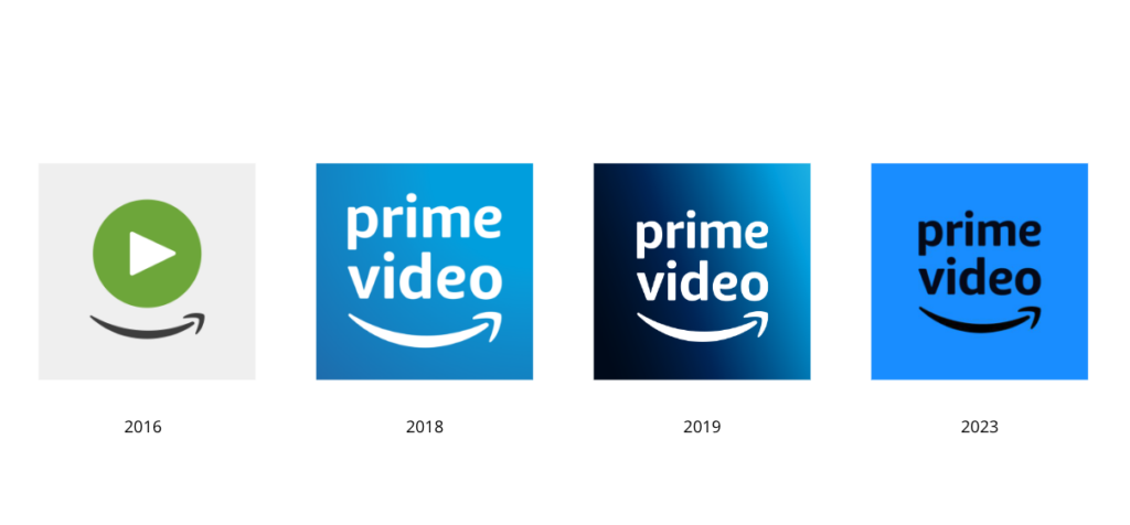
Prime Video, Amazon’s streaming service, has launched a completely new visual identity by Emily Oberman and her Pentagram team. The rebranding, however, is not a big surprise as it is a result of a process which had been carried out since August 2022.

Last year, Amazon Prime Video ranked second among streaming services, with 200 million subscribers, after Netflix (231 M) and ahead of Disney+ (164 M). The service’s collection includes series, sports, and premium channels, and there is something for everyone. It also offers original Prime Video programming like The Marvelous Mrs. Maisel, The Boys, The Lord of the Rings: The Ring of Power as well as NFL feeds in Thursday Night Football.
If you have an insignia, make it bolder. Make sure that it is the value of the brand. And that’s what Pentagram has made, renewing the visual branding of Amazon Prime Video. The designers also aimed to make the company stand out from numerous competitors today, including HBO, Apple+, Hulu, and smaller genre-based platforms. The other tasks were to highlight its own content, attract people’s attention to the wide range of entertainment, and position the service as something exciting for all types of fans and families.

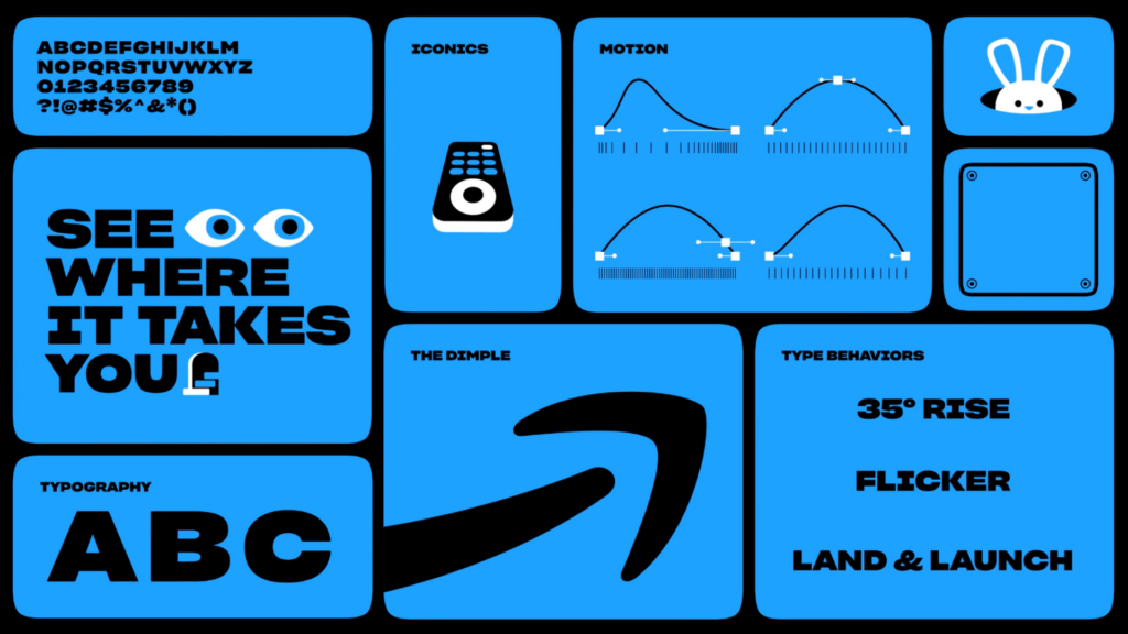
Pentagram’s solution came from Amazon’s iconic smile-arrow and through the “dimple” sign. The formal distinction of the curved line thus becomes a “catalyst guiding the audience through the endless wave of their favorite content”, the Pentagram team explains. But the project goes beyond.
This idea was embodied in the wave as one of the basic elements of the new visual identity. The platform’s subscribers can already see the refreshed branding in the user interface of the Prime Video app, which offers a quick search for their favorite movies, series, or programs at any time. And this is also a part of the new strategy.

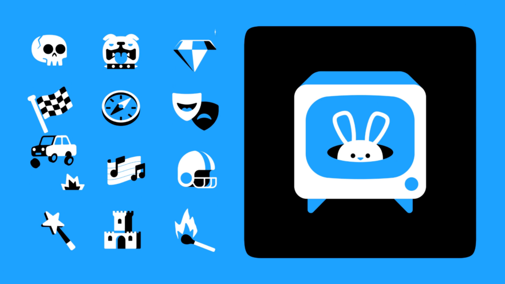
Another concept for the Prime Video look is the Rabbit Hole. Collaborating with the company’s in-house design team, Pentagram tried to present it as the idea of “an endless entertainment hole” where the audience can get lost among millions of pieces of content. This concept gives the brand’s individuality a cheerful, witty, and intellectual nuance.
Pentagram also created a custom typeface, cooperating with Lucas Sharp from Sharp Type. It’s a special version of Sharp Grotesk which can make system messages fluffy and funny and supports several weights matching the Prime font family. The font is developed to work together with dozens of funny symbols called Iconics, like vampire fangs, a light sword, a zombie hand, a cowboy, etc. They can represent different genres or simply form a “stenographic design”.

Overall, the result is quite attractive. The concept really works, and the brand receives individuality through this interplay of symbols, images, and typography. The combination of visuals is easy to scale across all types of carriers – from billboards to Prime Video apps.


