Established in 1842, the New York Philharmonic is the oldest orchestra in the United States. Celebrating its 180th anniversary this year, the musical collective is changing its look again. Like New York City, New York Phil is constantly renovated, as an official press release says.

The latest NYP visual identity update was six years ago when the orchestra marked 175 years of its journey. Now, the anniversary renovations also include the reconstruction of the David Geffen Hall which is a home for NYP.
So, the orchestra opens a new chapter in its history. This attempt, as it is called in the context of the new visual identity presentation, is aimed to create a new relationship between the city and its orchestra. The renovated concert hall allows musicians, singers and actors to get seen, heard and experienced from every angle. The official opening of the thoroughly refurbished David Geffen Hall is planned to take place in October 2022.

The New York Philharmonic looks different for the third time in 20 years. This time, too, a famous agency worked together with a famous designer. In 2009, Paula Scher was responsible for the redesign. In 2016, it was the MetaDesign team who were authorized to work for NY Phil. Now, the task was given to the New York-based agency group Ogilvy.

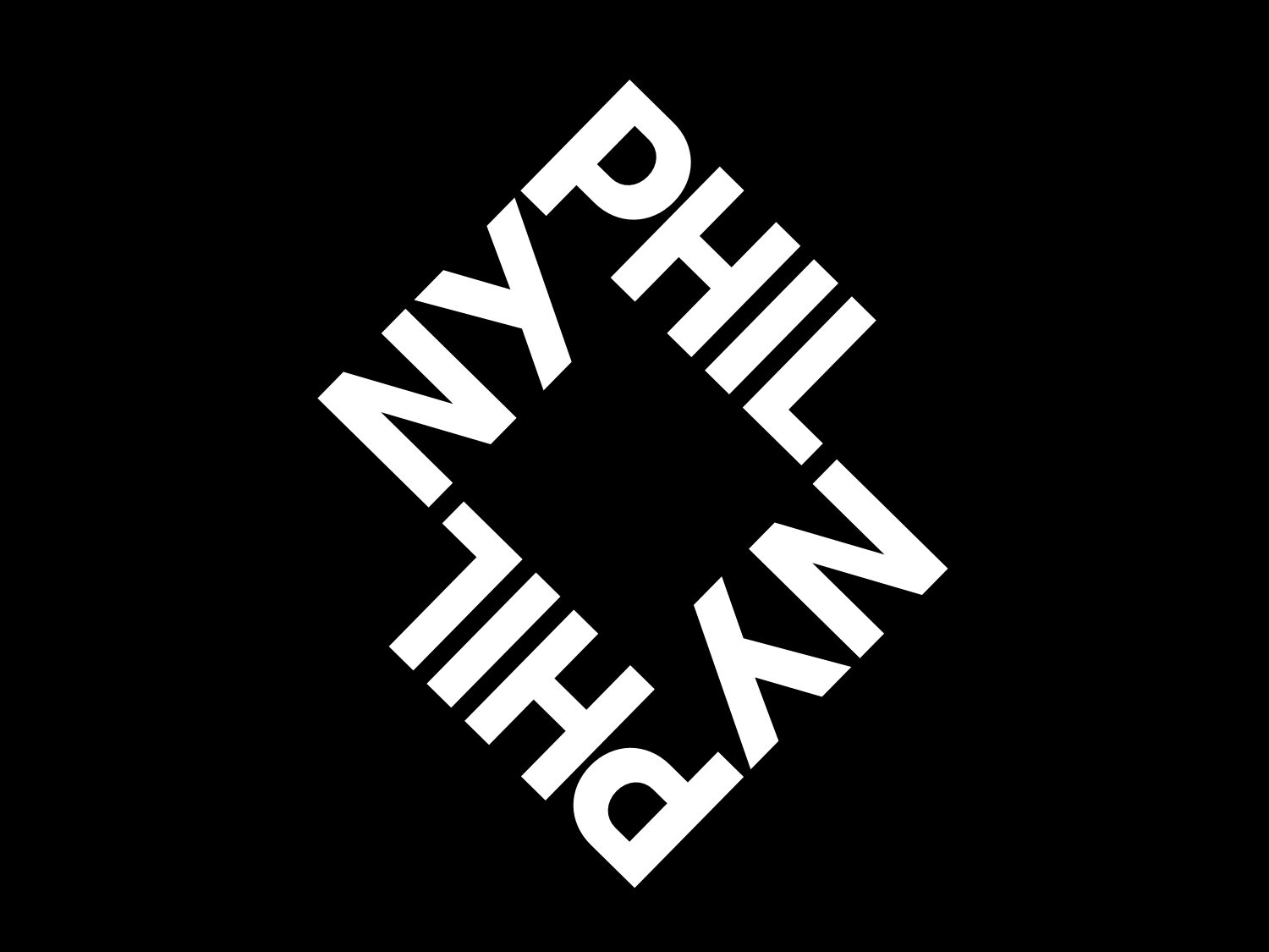
The new NYP logo was inspired by the architectural and structural environment at the intersection of 65th Street and Broadway in the center of NYC. The inspiration was also taken from the form of the Lincoln Square in which the Lincoln Center is. Like the previous emblem, the new one is a purely typological piece. However, unlike the 2016 iteration, it features the shorter name “NY Phil” only. The letter reduction with a transformation to square results in a compact sign. And this symbol through its form can be a base for some other patterns and design structures.


