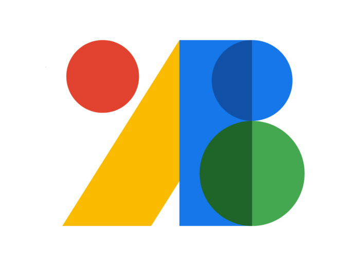
Google Fonts, a font library launched in 2010, has received a new logo. As with the redesign of its other online services, Google has used the red-yellow-green-blue color palette. The refreshment of the visual identity is connected with the introducing of new elements for web-design offered by the service.

The font library, previously known as Google Web Fonts, has long been a web standard. Ten years ago, the benefits of web fonts still had to be explained, while today the fonts, available on the service, are a usual part of web-sites. At the moment, Google Fonts offers 1043 font families that can be used for web-pages as well as print products.
According to Google’s Material Design blog, the icons, created within the Material Design project, are also included in the Google Fonts catalog. So, they can be integrated into your own web-project. As icons and iconography are a part of every design system, the company took a decision to share the whole icon collection that includes 2000 icons now.
 .
.As for the new Google Fonts logo, it was created to celebrate the service’s innovations. The F monogram has been replaced with colored circles and rectangles that form together letters A and B with a separate red circle, probably as a reminder of the previous logotype or a reflection of the icon section. The emblem conveys in a better way the essence of the Google Fonts products. It maintains all the basic elements of the Google logo style including four-color gamma, color overlapping as well as a combination of straight lines and curves.


