Founded in 1875, Bauer Media Group is one of the oldest publishing companies in Germany. Evolving into a multimedia conglomerate, the business group owns and operates over 1000 magazines and electronic products, as well as more than 50 TV and radio channels in Germany and abroad. Adapting to contemporary market conditions, BMG recently unveiled its new visual identity, which celebrates diversity and aims to inspire and enrich the entire community.

With its headquarters in Hamburg, Bauer Media Group has a workforce of nearly 15,000 employees across 18 countries. Under the leadership of Yvonne Bauer since 2010, the corporation is gradually shifting its focus from traditional publishing, which includes popular magazines like Bravo, Cosmopolitan, and TV-Movie, to a media house strategy.
According to an official press release, as the company transforms into an international media group, it has secured a leading position in the publishing and broadcasting industry. BMG has successfully invested in additional segments, such as daily newspapers and online platforms. The new corporate brand of BMG reflects the group’s development and its commitment to evolution, with a clear emphasis on digital technology.

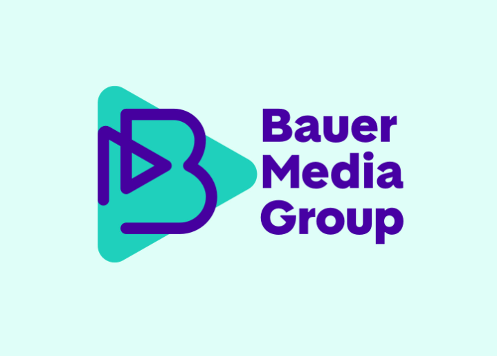
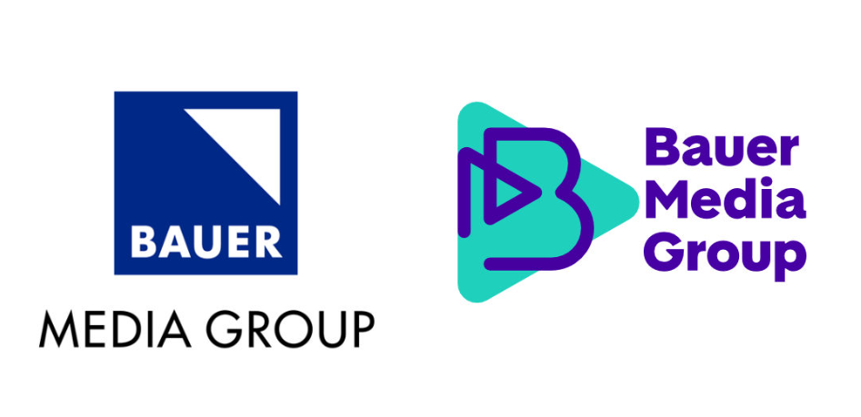
The corporation has been using its old logo, featuring a blue square with a white triangle inside, for over two decades. Now, this simple symbol is being replaced with a new visual signature that is completely different in structure, design, and expression. Unlike the previous version, the wordmark is now consistent with the icon, incorporating both capital and lowercase letters. Arranged in three lines and aligned to the left, the wordmark also forms a large “B” with the triangle from the icon. The triangle motif, inherited from the old emblem, is further supported by a prominent green triangle in the background, which symbolizes the Play button.

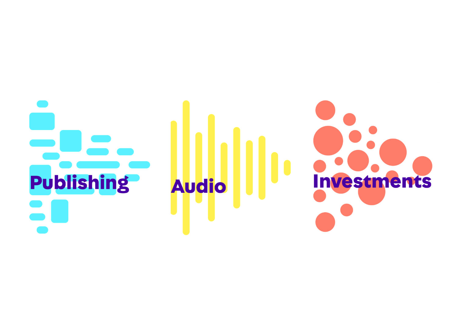
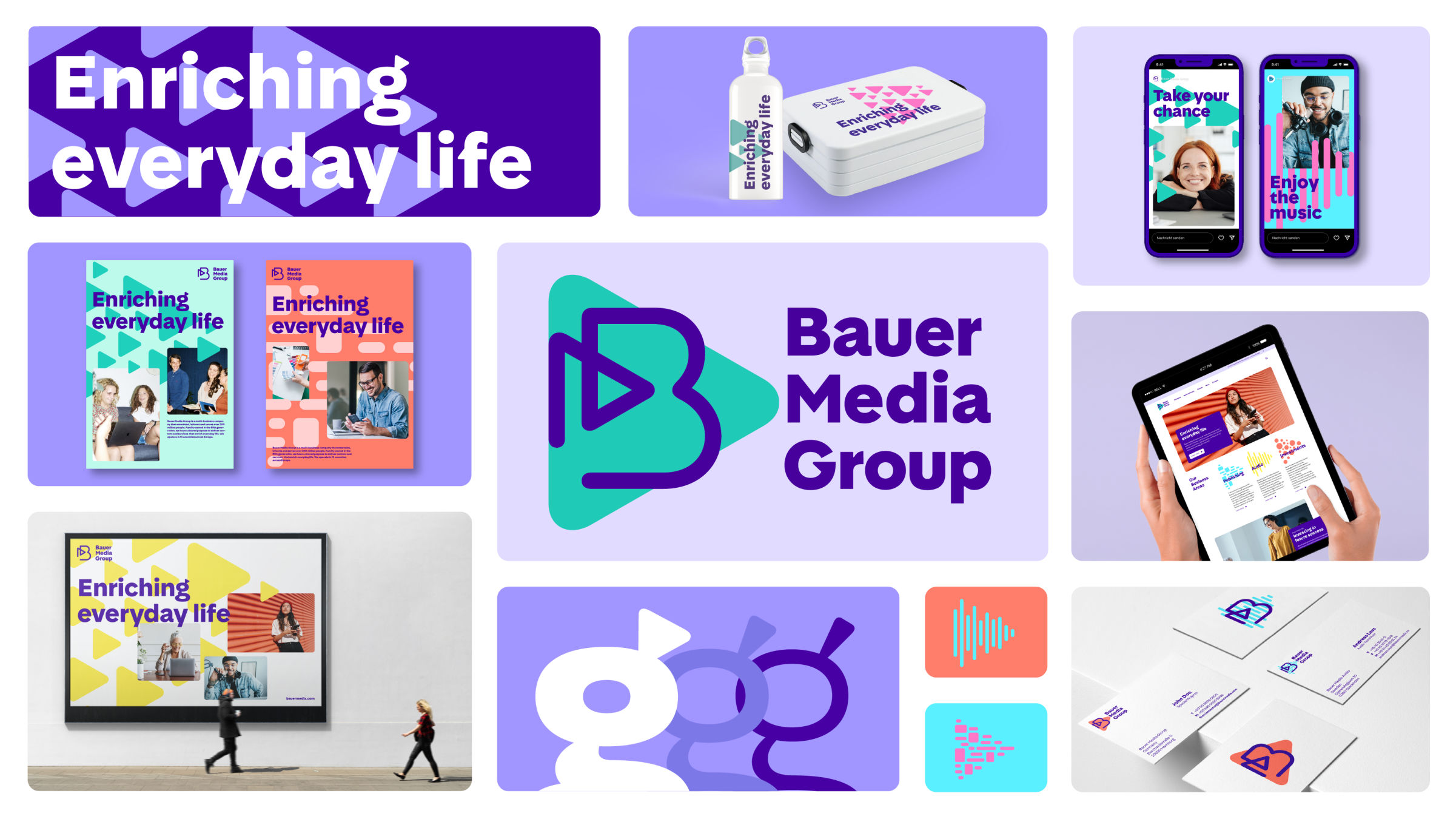
Turquoise and dark violet have been chosen as the main brand colors, complemented by accent colors like cyan, orange, pink, and yellow. This vibrant color palette gives the company a lively and colorful appearance. Additionally, a range of graphic elements referencing the Play button contribute to the energetic identity.
In place of Futura, the media brand will utilize a custom typeface called Bauer Media Sans, designed with inspiration from the Play button concept as well.

Overall, the presented design, which reimagines BMG’s historical iconography in a modern way, is a true breakthrough. The energy behind this rebrand is palpable, instilling motivation and creating a strong sense of identity and belonging.


