Duracell is an iconic brand of alkaline and rechargeable batteries manufacturing company, which was founded in 1920 in the USA by Samuel Ruben and Philip Mallory, a scientist and a manufacturer respectively. Today the brand is owned by Berkshire Hathaway.
Meaning and history
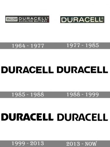
The official part of the Duracell visual identity has always been composed of a monochrome wordmark, which changes its typefaces and contours throughout the years, but the most recognizable part of all brand’s campaigns is a funny pink bunny, who was first introduced in the 1980s and became a globally recognized symbol of energy.
1964 — 1977
The first logo for Duracell was introduced in 1964 and featured a white nameplate with a tagline and an emblem, placed inside a black horizontally stretched rectangle. The wordmark was composed of all-capitals lettering in cans serif with wide and a bit extended letters, and an “Alkaline Battery” inscription under it, executed in the same typeface but with narrower sharper and less space between the symbols.
As for the emblem, it was a black “Mallory” logotype with a black horizontal line above it, placed inside a white rectangle.
1977 — 1985
In 1977 the logo was simplified to just a “Duracell” lettering on a black background. The inscription was executed in a refined sans-serif typeface with smooth clean lines and traditional shapes. The pink bunny was created in the same period, so the brand decided to make the logotype laconic and modest so that the whole image would be balanced and strong.
1985 — 1988
The new custom typeface appears on the Duracell visual identity in 1985. Bold black sans-serif inscription had all of the letters with traditional shapes and neat contours, but the “R” was modified and became the most eye-catching element of the emblem.
1988 — 1999
In 1988 the wordmark was redrawn again. All letters remained unchanged except for the “C” which became wider and more square. The only letter made the whole inscription look different — it became more powerful and progressive and started evoking a sense of strength and confidence.
1999 — 2013
The redesign of 1999 brought back the traditional shape of the “C” and softened all of the lines in the wordmark. The inscription became smooth, sleek, and elegant. On some of the versions, the pink bunny was placed above the iconic Duracell gold and black battery with white lettering on it.
2013 — Today
In 2013 the contours of the wordmark have been refined and cleaned. The Duracell logo we all can see today is composed of a very elegant and delicate wordmark with solid letters and smoothly rounded angles. It is timeless and minimalist, yet shows the brand as the reputable and serious, and the one that is constantly growing and changing.


