Naza Group is a Malaysian conglomerate involved in various business sectors, including automotive, property development, and hospitality. Founded by the late Tan Sri SM Nasimuddin SM Amin, the group is currently headed by his son, SM Nasarudin SM Nasimuddin. Operating mainly in Malaysia, the company also has a presence in several other countries. The group is a significant importer and distributor of cars, motorcycles, and other vehicles in Malaysia. It has strategic partnerships with international brands like Kia, Peugeot, and Harley-Davidson.
Meaning and history
Naza Group was founded in 1975 by the late Tan Sri SM Nasimuddin SM Amin in Malaysia. Over the years, the company diversified its operations and became a conglomerate with interests in automotive, property development, hospitality, and more. Among its key milestones are partnerships with international automakers like Kia and Peugeot, as well as involvement in luxury real estate projects. The group also owns and operates various hotel chains and leisure facilities. Currently led by his son, SM Nasarudin SM Nasimuddin, Naza continues to be a formidable player in the Malaysian market and has extended its footprint to other countries as well. The company maintains its status as a key distributor of vehicles and a significant contributor to the Malaysian economy.
What is Naza?
Naza Group is a Malaysian-based conglomerate with diversified interests, including automotive distribution and manufacturing. Founded in 1975, the company has partnered with international brands like Kia and Peugeot to import and distribute vehicles in Malaysia. The group is currently led by SM Nasarudin SM Nasimuddin, son of the late founder.
1975 – now
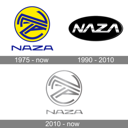
The original NAZA logo, designed in the middle of the 1970s, is still used by the Malaysian company today. It is a bright yellow roundel in a thin blue outline with an abstract geometric pattern made of medium-thick blue lines. The emblem is accompanied by a blue uppercase lettering executed in a custom geometric typeface with horizontally-stretched characters.
1990 – 2010
In 1990 one more logo was created for the company. It was a horizontally-oriented oval in solid black, with a very thin silver outline and and a massive and glossy NAZA inscription, written in a slanted sans-serif typeface, and making up a very progressive logo full of energy and motion.
2010 – now
The redesign of 2010 has brought the company’s identity back to its roots. The new badge is a refined version of the original NAZA logo. It is all the same but drawn in a different color palette — the bright yellow was replaced by plain white, while all the blue lines turned gradient silver, with calm light tones and a matte surface.


