The National Lottery, primarily active in the United Kingdom, is engaged in organizing various lottery games. These games include Lotto, EuroMillions, and instant win games, contributing to public sector funding. Owned by Camelot Group, its major market is the UK, with a focus on responsible gaming. The Lottery is regulated by the UK Gambling Commission, ensuring legal and ethical operations. This arrangement supports public projects in areas like sports, arts, and heritage.
Meaning and history
The National Lottery’s saga began in 1994, aiming to fundraise for UK’s public sectors. Initially managed by Camelot Group, it soon became synonymous with national philanthropy, channeling billions into various community enrichments. The early years were about expansion, diversifying games and embracing digital platforms, enhancing reach and user experience.
Ownership shifts marked the 2000s; Camelot was acquired by the Ontario Teachers’ Pension Plan in 2010, injecting new capital and vision. This era also intensified regulatory oversight, embedding fairness and responsible gaming at its core.
Recently, the Lottery has pivoted towards ethical gaming, balancing profitability with social responsibility. It remains a pivotal public funder, adeptly navigating market and consumer trends while steadfastly supporting societal welfare.
1994 – 2002
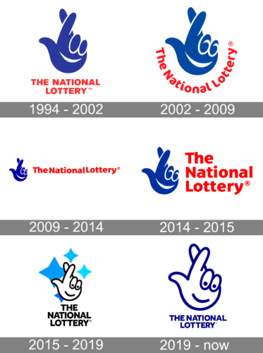
The logo features a prominent, stylized hand in a royal blue hue, its fingers curling into a dynamic and abstract gesture that conveys motion and excitement. The thumb and fingers form a shape that could be interpreted as a metaphor for good luck or celebration. Below the hand, the words “THE NATIONAL LOTTERY” are written in a bold, sans-serif typeface.
The color of the text is a stark, assertive red, creating a strong contrast with the blue and drawing attention to the name. The use of uppercase letters for the text underscores the logo’s authoritative presence. The entire logo is set against a clean, white background which emphasizes its clarity and makes it stand out.
2002 – 2009
This logo depicts an uplifting hand rendered in a deep blue color, encapsulating a sense of joy and luck. The hand’s outline curves into a whimsical wave, with a playful trio of circles on the palm, possibly representing lottery balls. Below it, “The National Lottery” is inscribed in a confident, red script. This logo maintains the essence of its predecessor, preserving the hand motif and color scheme, yet there’s a noticeable evolution in design. The text appears more modern and streamlined, and the hand is more abstract, reflecting a modernized approach to branding.
2009 – 2014
The logo presents a cheerful hand in navy blue, with a trio of circles evoking lottery balls nestled in its curve, symbolizing both a welcoming gesture and good fortune. “TheNationalLottery” is inscribed in an unbroken, bold red font to its right, indicating a seamless, united identity. Compared to the previous version, this design opts for a more contemporary look, integrating the text with no spaces, and employing a modern, sans-serif typeface. This evolution speaks to the brand’s adaptability and modern appeal while retaining its iconic hand imagery.
2014 – 2015
The logo showcases a jubilant blue hand, with swirls and circles representing both dynamism and lottery balls, paired with “The National Lottery” in a bold, red font. The text spacing here breathes a classic air, distinct from the previous compact styling. The traditional serif font adds a touch of formality and heritage. This design holds onto the familiar color scheme and imagery, but the reintroduction of space between words in the title marks a return to a more conventional and perhaps accessible presentation.
2015 – 2019
This iteration of the logo features a cartoonish white hand with a friendly face, giving a thumbs-up, surrounded by three whimsical blue stars, against a plain backdrop. The text “THE NATIONAL LOTTERY” is presented in a bold, blocky black font, emphasizing a fun and approachable image. This design marks a significant departure from its predecessor’s more abstract form, opting for a literal and personable representation. The stars add a playful element, suggesting celebration and excitement.
2019 – Today
The logo displays a playful, white hand outlined in navy blue, giving a thumbs-up with a smiling face, evoking friendliness. “THE NATIONAL LOTTERY” is stated below in a clean, sans-serif navy blue font. This design simplifies the previous version, removing the stars and opting for a two-tone color scheme, which adds a touch of modern minimalism while maintaining a cheerful, approachable vibe. The consistency of the color and the preservation of the hand and facial features convey continuity and a lighthearted brand personality.


