While the American stock exchange Nasdaq stuck to its original logo for more than 40 years, it had to eventually replace it by a more modern one.
Meaning and history
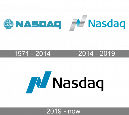
1971 – 2014
The first Nasdaq logo featured the name of the brand to the right of the globe emblem.
The wordmark showcased a rather heavy all-caps type. While the glyphs were generally pretty simple, the combination of their weight and shape created a subtle legibility problem. Although it was more obvious in the case of the “D,” the “Q” glyph was not a perfectly clean and legible one, too.
The emblem depicted a stylized globe with multiple details in white symbolizing the type of organization to which the logo belonged.
While the logo was typically given in teal and white, a black-and-white version was also used rather often.
2014 – 2019

In 2014, they adopted a thinner and softer font for their main wordmark. In this version, it also started using lowercase letters. The emblem changed into a silver ribbon a blue underside shown in the middle. It’s shaped like a lightning bolt, which is supposed to look like a letter ‘N’.
2019 – Today

The stock exchange completely redesigned its logotype to make it look more modern. It now better fits contemporary design trends.
The heavy and detailed globe in the Nasdaq logo has been replaced by a dynamic “ribbon” due to which the design has become meaningful.
Font
The wordmark is by far lighter and better legible than its predecessor. At first glance, the letters may seem generic, yet if you take a closer look, you will notice a lot of unusual details, from the unique curves of the “a’s” and “d” to the diagonally cut end of the “q.”
Company overview
Nasdaq is ranked second on the list of stock exchanges by market capitalization of shares traded. It is located at One Liberty Plaza in New York City. Nasdaq was founded in 1971.
While initially, the abbreviation meant the “National Association of Securities Dealers Automated Quotations,” this explanation is rarely used now.


