BCI is a short name of the Chilean Banco de Crédito e Inversiones, which was established in 1937 and is considered to be one of the most popular and reliable financial organizations across the country, with yearly revenue of about 3 billion USD.
Meaning and history
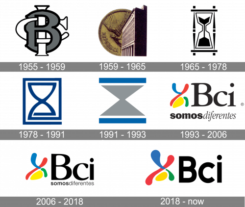
The visual identity of the famous Chilean bank is a graphical representation of its progress and evolution. There were seven major redesigns of the logo made throughout the bank’s history, and each new emblem is a modernized and evolved version of the previous one. Though the first two designs were random — executed in traditional for their times’ manners.
1955 – 1959
The original BCI logo was composed of three bold intertwined letters, where “C” and “I” were white with a thin black outline, and the “B” featured a thicker outline and gray color of the body.
1959 – 1965
The version of 1959 was composed of two graphical symbols — an image of the bank’s main office building in ¾, placed on a background with an enlarged coin with an eagle. It was a pretty unusual logo, which stayed with the company for six years.
1965 – 1978
The iconic hourglass emblem first appeared on the bank’s visual identity in 1966. It was a stylized monochrome image with bold clean lines and geometric contours. The hourglass was supposed to show how the BCI values the time of their customers. There was nothing more on the logo, not even a wordmark.
1978 – 1991
The hourglass was redrawn in 1978. The color palette was switched from monochrome to blue and white, which represented reliability and comet. The new modernized contours of the drawing made the whole logo look more stylish and contemporary.
1991 – 1993
In 1991 the sharp geometric version of the iconic emblem was introduced. The strict triangular hourglass now featured light gray color and had two wide blue horizontals under and above it.
1993 – 2006
The name of the bank was officially shortened to BCI, and the visual identity was redesigned according to the new concept. The stylized hourglass was now executed in three smooth lines in blue, green, and red, and a solid yellow spot in its bottom part. The “Bci ” wordmark in a title case was written in black and executed in a classy serif typeface.
2006 – 2018
The contours of the emblem have been cleaned and refined in 2006. As for the wordmark, its typeface was switched from a traditional sans-serif to a modern and smooth serif, which gave the whole logo a more professional and luxurious look.
2018 – Today
The logo we all can see today was created in 2018. The emblem got enlarged and softened, while the lettering became bolder and more brutal. The Bci logo today is perfectly balanced and is very memorable.
Font and color
The new Bci inscription in the title case is executed in a simple and clean sans-serif typeface, using its heavy ExtraBold version. Being colored in black, the wordmark looks confident and powerful.
As for the color palette, the blue, green, red, and yellow image was inspired by the famous artist Juan Miro and stands for attention, passion, growth, and happiness. This is the way to shows the bank’s attitude to the customers and their main values.


