The simplicity of the Naf Naf logo lets the designers endlessly experiment with the style of the collections. Yet, such a logo does not say much about the brand.
Meaning and history
Naf Naf is a prêt-à-porter brand of women’s apparel founded in 1973 in Paris by two brothers, Patrick and Gérard Pariente. Their first shop was called “Naphtaline1,” while the boutique they opened five years later was named “Influence.”
1985 – 1986
The earliest boutique sign contained the company’s original name, so we can hardly discuss the Naf Naf logo, in this case.
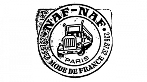
The brand’s website, though, contains a print ad published in 1984 and featuring their “Le Grande Méchant look.” It also has the lettering “Naf Naf,” which looks utterly different than the current wordmark. It is given in a serif typeface. It looks pretty light and elegant. Also, the ad showcases a roundel logo. In the middle, there is a pictorial part, while the word “Naf Naf” can be seen in the thick ring encircling the emblem.
1986 – 2004
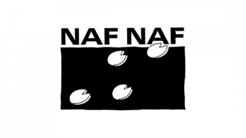
In 1986, they wrote the brand’s name in black capital letters right above a black rectangle. Over both of these parts, there were several white circles drawn with some perspective and with small triangular chucks chipped from them for some reason.
2006 – 2021
In 2006, everything except the name part was scrapped.
Wordmark
The primary logo features the lettering “Naf Naf” in an austere sans serif type. The font is slightly flatter than the average.
Symbol
Sometimes, the company uses a stylized pig’s hoof emblem. It can be either used instead of the wordmark or paired with it.


