MO is a brand of clothing and accessories offering a wide range of products for men, women, and babies. It is part of the Sonae group. The number of stores reaches 120 (according to the brand’s website, the information retrieved in 2021).
Meaning and history
The brand started working in 1995 under the name Modalfa.
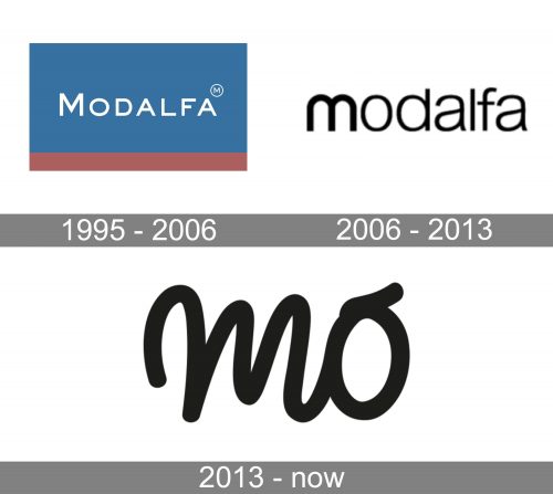
1995 — 2006 (Modalfa)
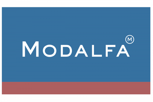
The original Mo logo resembles a flag consisting of two horizontal fields. The upper field is of a soft blue tone and houses the word “Modalfa” in white. The lower field is by far smaller, more like a stripe. It is filled with a soft color that can be described as a brownish shade of red or a reddish shade of brown.
The type used for the wordmark is a clean sans serif one. All the letters are capitalized, but the initial is larger than the following glyphs. The type is a pretty generic one, yet it is highly legible.
2006 — 2013
If you try to find something in common with the previous version, you will hardly manage to do it. Here, the flag is reduced to a simple wordmark in black. The glyphs have grown friendlier, rounded. Also, they are lowercased now. The emphasis on the initial is created with the help of a slightly bolder type.
2013 — present (Mo)
This version has a totally different style. It is by far more relaxed and casual than the previous logo. The word “MO” is set in a carefree cursive script – it looks as if someone has just written it quickly without caring too much about perfect calligraphy.
The style perfectly fits the brand’s slogan, “it makes it easy to decide what to wear.”
Font
The handwritten script of the current Mo logo creates a personal touch, which is of uttermost importance in the era, when people grow more and more immersed in the digital world and lack human attention.
Colors
Like many other fashion brands, Mo prefers to have a simple black logo on the white background. The color of the wordmark can be changed depending on the visual context, into which it is placed, thus making the design universal and highly customizable.


