Milky Way is a brand of the chocolate bar, manufactured by Mars since 1924. The bar is known for its tender and light taste and got its name because of the white nougat filling.
Meaning and history: worldwide version
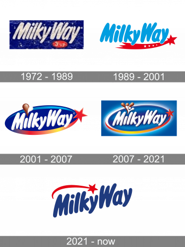
Despite all the updates, the visual brand identity has always been based on a combination of white with various shades of blue. The star theme inspired by the “astronomical” interpretation of the brand’s name has been prominent.
What is Milky Way?
Milky Way is the name of a chocolate bar brand, owned by the Mars Corporation, and first introduced in the middle of the 1920s. The bar has a smooth white filling, covered with a thick layer of a milk chocolate.
1972 – 1989
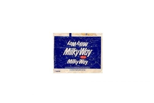
One of the older packages featured the words “Milky Way” in white over the dark blue background containing multiple “stars.” The glyphs were elongated, with rounded ends.
There were no serifs. The letters looked casual as if they had been written by hand, although there were no links between them.
1989 – 2001
The type grew somewhat plumper and curvier. It was now dark blue on the white background. A red comet appeared below, with four tiny stars on its tail.
2001 – 2007
The dot above the “i” was replaced by two drops, a brown one and a white one, symbolizing the chocolate and milk.
The tail of the comet was colored in various colors but lost the small stars. A dark blue ellipse became the background for the white words.
2007 – 2021
In the European version, the number of drops above the “i” grew larger, while the red star moved higher.
2021 – Today
The redesign of the Mars visual identity, which took place in 2021, has emboldened and simplified the iconic badge, it is still a smooth and bold recognizable lettering, but now set in flat blue lines, written against a plain white background and accompanied by a red emblem, depicting a five-pointed star with a long arched tail. The emblem on the new badge is placed above the logotype, covering the “Milky” part of the wordmark.
Australian/Asian version: since 2007
The overall look of the package is pretty much the same. Yet, the ellipse in the background has a softer border formed by white steam. The red star has preserved a pronounced red tail. There are only two drops above the “i.”
US version: since 2001
The American version of the Milky Way logo features a more “natural” or even “rural” palette. Here, the package is dominated by brown. The letters are green, with rectangular ends. The white trim supports the “milk” theme.
Font and Color
The smooth heavy lettering from the primary Milky Way logo is set in a custom sans-serif font with the rounded edges, and slightly narrowed contours of the title case characters. The closest fonts to the one, used in this insignia, are, probably, Fun Club Sprit, or Jolly Angel Italic, but with the contours of all letters significantly modified.
As for the color palette of the Milky Way visual identity, it is based on the iconic and powerful combination of blue, red, and white, which has been with the brand for the decades now, and looks very stylish and professional.


