Michael Jackson is the legend of pop music, also known as the King of Pop, who was born in 1958 and died in 2009. During his intense and bright career, the famous American singer and songwriter has released ten albums and earned numerous prestigious music awards.
Meaning and history
One of the most significant and well-known singers in history, the legend of pop-music, Michael Jackson, always paid a lot of attention to his brand’s visual identity, and all the design features. His logo history was pretty intense and had around five redesigns throughputs the years.
Despite numerous redesigns, there has always been one feature that never changed — the monochrome color palette, a sigh of power, quality, and timeless elegance.
1964 – 1982
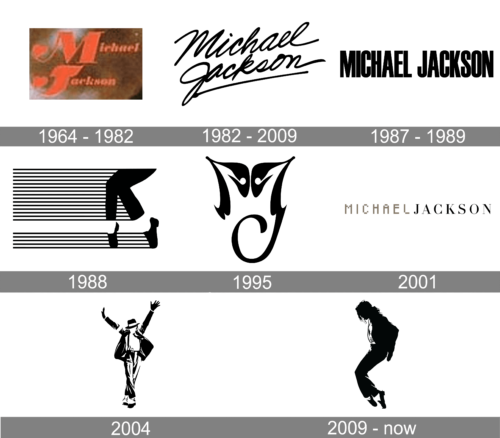
The very first logo used by the legend of pop music from the middle of the 1960s to the beginning of the 1980s boasted a two-leveled inscription in red, with the heavily enlarged first letters of both lines. The logotype was set in a fancy and elegant cursive, which evoked a sense of passion and energy thanks to the bright scarlet-red shade of the letters.
1982 – 2009
The very first logo for Michael Jackson was designed in 1982. This was the one and only logo used by the singer until 1988, and one of many used until 2009.
It was simple black lettering, repeating the Michael Jackson signature. It was usually placed on a white background and looked perfect on any background with different illustrations.
1987 – 1989

The redesign of 1987 created a very strict and minimalistic badge for the Pop Scene. It was a clean and stable uppercase lettering in a bold yet slightly narrowed sans-serif font, with black lines set against a white background. This was a timeless and very elegant insignia, which could still be actual today.
1988
The most iconic and recognizable logo was designed in 1988. It was an image, showing the famous moonwalk. Two legs in black and white were placed on the right side of a horizontally placed white rectangle with numerous thin black and white stripes and one wide white.
1995
The logo design from 1995 was something new for the brand. It was a stylized monogram, where two letters “M” and “J”. The upper part of the image resembles a butterfly, while the smooth “J” and its curve looked like a long playful tail of a small monkey. Or a cat. This monogram was used on the cover of only one album — HIStory.
2001

In 2001 a new logo for Michael Jackson was created. It was a one-line inscription in two completely different styles, with the “Michael” set in a designer pixel font in gray, and the “Jackson” in black capitals of a super traditional and elegant serif font with sophisticated contours and sharp serifs.
2004

In 2004 the new logo was created for the Michael Jackson brand. It was a graphical image, showing the legendary singer dancing with his hands up and legs crossed. Michael was wearing a black suit, an iconic hat, and black-and-white shoes, the same look as from the “Black or White” video clip.
2009 – Today
After the singer’s death, the series of logos were designed. There were different options — graphical ones and logotypes, minimalist, and detailed. The most famous graphical was composed of the stylized singer’s silhouette standing in profile and doing his moonwalk. It was executed in black and usually placed on a white background.
Another version was composed of the wordmark where “Michael” and “Jackson” part in all capitals were divided by the black crown. The lettering was executed in a sleek and modern serif typeface with thin and delicate serifs.
There was also a monogram version, based on the logotype. Intertwined “M” and “J” in the same font were complemented by the black and white crown above the capital “J”, which was placed in the center of “M”.


