All the 15 sports teams of the University of Miami have one common name ‒ the Miami Hurricanes. It stands to reason that they share one and the same logo.
Meaning and history
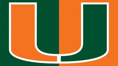
The athletic program from the University of Miami, Miami Hurricanes, is often nicknamed The U, due to its stylish and minimalistic logo, with the letter “U”formed by two mirrored elements in green and orange.
The program is composed of 15 teams, where male and female students of the university compete with the clubs from other colleges in such kinds of sports as Baseball, Basketball, Track and Field, Swimming, Golf, and many others. The program is a member of the first division of the NCAA.
What are Miami Hurricanes?
Miami Hurricanes are the name of an athletic program of the University of Miami, Florida. The program consists of 15 men’s and women’s teams, which compete in the first division of the National Collegiate Athletic Association in various sports disciplines, including Baseball, Volleyball, Football, Tennis, and others.
1940 – 1964
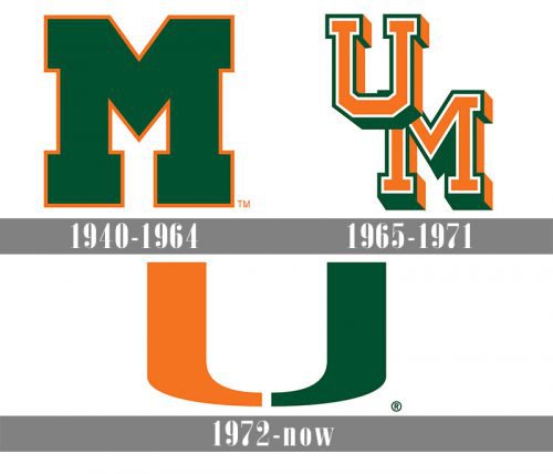
The Miami Hurricanes logo has always been a lettermark logo based only on typography. It had evolved from the letter “M” to the acronym “UM” before it took the shape of the split letter “U”.
The history of the Miami Hurricanes logo started in 1940. The first sport emblem was the letter “M” which stood for Miami. It was in green outlined in orange.
1965 – 1971
In this form, the emblem existed until 1965, when the letter “U” was added to it. Also, for this version, the design of the “M” was slightly updated. The palette was now dominated by orange.
Needless to say, the abbreviation meant the University of Miami. It was of orange color with a white and green outline.
1972 – Today
The current emblem is even more minimalistic. The only image depicted in it is a stylized letter “U” in two colors. The right section is green and the left one is orange. Yet, white is also incorporated in the symbol. It is the space between the two sections of the letter “U”.
The split-U logo was the outcome of the 1973 redesign. As opposed to the “UM” that could have stood for many other institutions, the U symbol is unique. When people see it, they automatically recollect the University of Miami.
Miami Hurricanes cross country
Both the men’s and women’s cross country running programs of the University of Miami are headed by Amy Deem.
Miami Hurricanes basketball
The highest achievements of the men’s basketball team of the University of Miami have probably taken place in 2000, 2013, and 2016 when the Hurricanes reached the NCAA Tournament Sweet Sixteen. As of 2019, they have appeared in ten NCAA Tournaments and 11 National Invitation Tournaments. The women’s team reached the NCAA Tournament Sweet Sixteen in 1992. It has made 14 NCAA Tournament appearances.
Font and color
The minimalistic and sleek badge of the Miami Hurricanes is composed of two mirrored “J”-like elements, making up a bold extended letter “U” with a stencil in the middle of its bottom line. There is usually no additional lettering on the emblem.
The color palette of the Miami Hurricanes’ visual identity, is based on three main shades: green, orange, and white, where green stands for growth and progress, orange for strength and energy, and white — for loyalty.


