

![]() 4H Logo PNG
4H Logo PNG
Although the 4H logo has been modified more than once throughout its more than 100-year history, this has been an evolution rather than a revolution. The main element – a four-leaf clover – has always stayed the same.
Meaning and History
![]()
4H, a global network of youth organizations, was founded in the United States in the early 20th century to encourage young people’s involvement in agricultural clubs. The initial focus was on teaching practical agricultural skills, which was a vital aspect of life in rural America at that time. The organization expanded rapidly, emphasizing the importance of developing all facets of a young person’s life, including head, heart, hands, and health, symbolized in the four ‘H’s in its name.
Over the years, 4H has evolved, achieving major milestones in youth development. It became a key player in empowering young people with skills in leadership, citizenship, and life skills through various interactive and hands-on learning experiences. Notable achievements include significant contributions to agricultural research and development, fostering a spirit of community service, and promoting environmental stewardship among youth. 4H’s initiatives have been instrumental in shaping future leaders and innovators across various sectors.
Today, 4H stands as a prominent global youth development organization, reaching millions of young people in over 50 countries. Its current position reflects a broadened scope beyond agriculture, embracing science, technology, engineering, and math (STEM), healthy living, and civic engagement. 4H continues to inspire the next generation, adapting to contemporary challenges and preparing youth to lead in a rapidly changing world.
What is 4H?
4H is a global youth organization focusing on empowering young individuals through experiential learning and development in various fields, including agriculture, STEM, and civic engagement.
1952
![]()
The 4H emblem, introduced in 1952, featured a monochrome light gray composition with the iconic four-leaf clover as the main element. It was set above an arched outlined in black ribbon with the uppercase sans-serif “Canada” lettering on it. The ribbon and inscription were actually more visible than the light gray image with four white letters “H” on its leaves.
1959
![]()
The redesign of 1958 made the 4H logo more balanced and strong by refining its colors and emboldening the contours of all elements. All the leaves of the clover were now colored black and outlined in white, giving the bold white capital letters “H” placed on each of the petals. The straight lines of the letters balanced the smooth contours of the leaves, and also harmonized the emboldened “Canada” inscription from the ribbon, arched under the clover, also in black and white.
1982
![]()
The intense green color first appears in the 4H logo in 1982. This is when the color palette was changed completely, with no more black accents, simply green and white. The clover was redrawn in a smooth modern style with no outline of the leaves, white the ribbon and the background of the plant got come green lines as accents. The four letters “H” became larger and bolder and got their edges cut straight and square.
2015
![]()
The birth of the 4-H program was the result of the work of a few people in different parts of the US. It was mainly concerned with rural children. One of the personalities connected with the creation of the 4-H program was B. Graham, who worked in Clark County, Ohio.
One more center of the newly-formed youth movement was Douglas County, Minnesota, where T.A. Erickson invited children to after-school activities connected with agriculture. Unlike most organizations for children of the time, the predecessors of the 4-H clubs had something to offer not only for boys, but for girls either.
Symbol
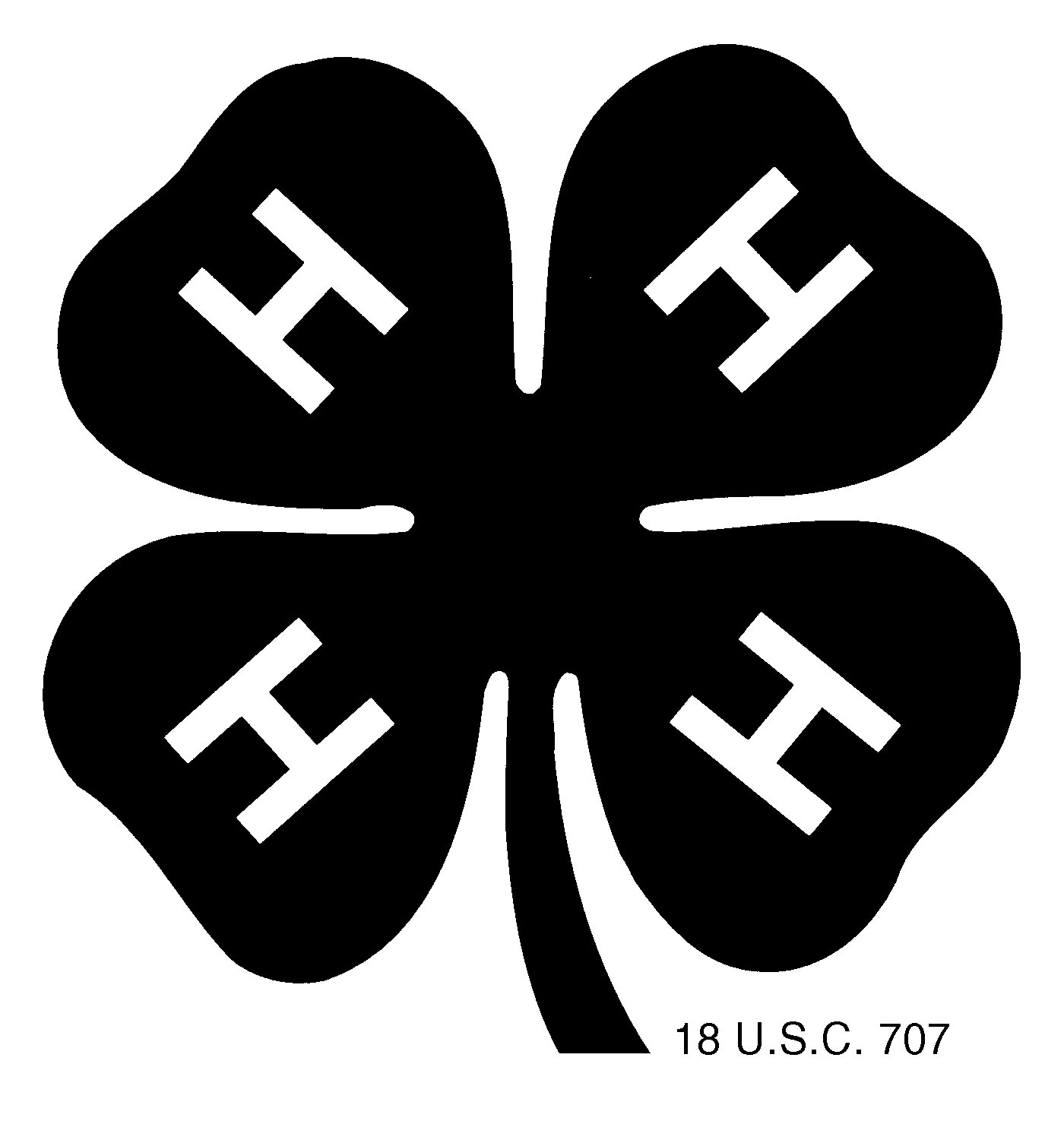
The earliest emblem for the club depicting a clover pin with the letter “H” on every leaf was created by Jessie Field Shambaugh in 1910, two years before the name “4-H” was adopted. Why did Shambaugh put an “H” on each of the clover leaves? It was because the club’s earliest motto was as follows: ‘head, heart, hands, and health’, hence the name of the program.
How did the emblem become official?
However, it was not until 1924 that the clubs were joined together and acquired one and the same name. As soon as they were united in a single network, the clover emblem received the status of its only official emblem.
Font
![]()
The 4H logo features a simple sans-serif typeface. There is nothing special about any part of the letter “H”, except that it is perfectly legible and clear.
Color
![]()
The saturated, natural shade of green used in the 4-H logo reminds the color of the leaves and grass. This helps to create a link with rural life, nature, and health, which have always been a part of the club’s core values. The white background symbolizes purity.


