Mexicana de Aviación is a prominent airline company in Mexico. It offers domestic and international flights, catering to both leisure and business travelers. The company is privately owned and has a rich history in the aviation industry. Today, Mexicana de Aviación operates from its hub at Mexico City International Airport, providing convenient connections to various destinations across the globe. With its experienced staff and commitment to safety, the airline continues to serve as a reliable choice for air travel.
Meaning and history
Mexicana de Aviación, founded by Antonio Díaz Lombardo and Juan A. Azcárraga, took flight in 1921, making it one of the oldest airlines in the world. Over the years, it achieved several milestones, including being the first airline to offer transcontinental flights from Mexico, introducing jet aircraft into its fleet, and expanding its routes to destinations worldwide. However, Mexicana de Aviación faced financial difficulties and ceased operations in 2010. Despite efforts to revive the airline, it has not resumed regular operations.
What is Mexicana de Aviación?
Mexicana de Aviación was a Mexican airline that operated from 1921 to 2010. It was one of the oldest airlines in the world and a prominent carrier in Mexico. However, due to financial difficulties, the company filed for bankruptcy in 2010 and ceased all operations.
1940 – 1968
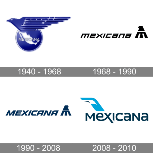
The original Mexicana logo was drawn in a bright blue and white color palette. The composition featured a solid blue roundel with the white contour of the country overlapped by an outlined wordmark on it and a stylized blue bird attached to its top part. The bird had a straight geometric wing and looked very modern and strong.
1968 – 1990
The redesign of 1968 has created a minimalistic geometric logo, composed of bold black lettering in the lowercase of a distinctive sans-serif typeface with straight cuts of the bars and slanted characters, followed by a stylized bird emblem, formed of two solid black elements.
1990 – 2008
In 1990 the color palette of the Mexicana logo was switched to blue and white, and the lettering was rewritten in the uppercase of a refined sans-serif typeface. The emblem remained the same, just changed its color from black to blue, and the upper part of the bird pyramid was now turned to the right.
2008 – 2010
The redesign of 2008 introduced a completely different concept of the Mexicana logo. The last version of the badge boasted a stylized blue lettering with a sky-blue emblem above it. The emblem depicted a smooth plane wing with a white and dark-blue element on it.


