Metropolitan Life Insurance Company (more often shortened to MetLife) had its first logo created by a US designer Don Ervin. The blue wordmark was accompanied by a star, which can be also interpreted as a stylized image of either M or L characters.
Meaning and history
The MetLife logo was redesigned twice in the company’s history, though all three versions of its visual identity are similar in their style and confidence. All of them evoke a sense of authority, expertise, and confidence.
1970 – 1998
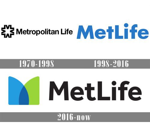
The company was established in 1970 as Metropolitan Life, so the first logo, created in the same year, was based on the logotype with the original name, placed in the right from an abstract geometric emblem. Both elements were executed in bold black lines and set in a white background. The inscription was written in a title case of a traditional and neat sans-serif typeface.
1998 – 2016
The company was renamed MetLife in 1998, and the logo was changed accordingly. The new emblem featured a bold blue wordmark executed in a modern sans-serif typeface with thick solid lines. The “M” and “L” of the logotype were capitalized, though there was no extra space between the two parts of the inscription.
2016 – Today
The graphical element was added to the MetLife visual identity in 2016. Now the logo of the company is composed of a black logotype with two capital letters capitalized placed on the right from a delicate and modest emblem, formed by two mirrored triangles in blue and green, with one of the sides arched.
Font and color
The simple yet massive and confident MetLife logotype is executed in a bold sans-serif typeface, which is very similar to such fonts as Steam Text Bold and Hartwel Bold, with the traditional shapes of the letters, neat and strong contours, and smooth thick lines.
The blue and green color palette of the MetLife visual identity represents growth, success, and wellbeing, and balanced by a bold black inscription it evokes a sense of trustworthiness and stability.


