Mercado Livre is the Brazilian daughter of MercadoLibre, one of the most famous marketplace portals in Latin America. The service was created in Argentina in 1999. During the first years, the portal only operated in Latin American countries, but after 2018 it expanded to Portugal and Spain.
Meaning and history
Millions of offers, dozens of categories, the lowest prices, and the different options of delivery are what Brazilian Mercado Livre can offer to its customers. Everything from cell phones and keyboards to food and beverages, you can find in one place. The website also has a section with offers of the day, where customers can find a selection of goods for significantly discounted prices.
The visual identity of Mercado Livre has always used the style and concept of its mother company, Mercado Libre. The only thing that varies was one letter. All the other elements, as an emblem, color palette, typeface, and size of the lettering was repeating the corporate logo to the smallest detail.
What is Mercado Livre?
Mercado Livre is the name of a Brazilian online marketplace, which is the Sun brand of the Latin American Mercado Libre company. The platform offers thousands of products in all possible categories and allows people to sell and buy the items for a better price.
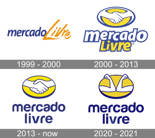
1999 – 2000
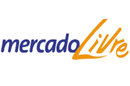
The initial logo, created for the marketplace was a trial one and stayed only for a few months, so was only used for the mother company. It was lettering in two styles — a dark blue lowercase “Mercado” in an italicized elegant typeface, and a bold handwritten “Libre” in dark yellow, glued to the first part of the logo.
2000 – 2013
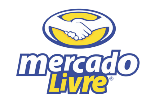
The new concept was introduced in 2000 and it was there to stay. The logo was still executed in a yellow and blue color palette, but this time it was set in three levels — the emblem on top, and the wordmark on two floors under it. The emblem depicted a horizontally oriented oval with an image of a hand-shake in white, with a blue outline.
As for the inscription, it was written in a custom bold sans-serif typeface, with letters slightly jumping. The upper line was in white, with a bold blue outline, and the bottom one — in yellow and blue.
2013 – Today
The logo was refined and modernized in 2013. The color palette got elevated and the bright blue was replaced by a darker and richer shade, while the yellow also got two tones darker. The handshake image got its contours strengthened and cleaned, and the lettering was redrawn too.
The new logotype was set in a modern sans-serif typeface, with all letters in the lowercase. Both levels of the wordmark were set in the same shade of blue, that was used for the emblem.
2020 – 2021
With the Covid-19 pandemic, the company changes its logo according to the new “social distancing” policy in 2020. The handshake was replaced by the two elbows touching each other as a sign of greeting. All the other elements, including the color palette and the typeface, remained untouched.
Color and font
The blue and yellow color palette is one of the most frequently used combinations for various logos. These colors together stand for reliability and professionalism on one hand, and energy and happiness on the other. White accents of the emblem and the background stand for loyalty, trustworthiness, and safety.
As for the lettering, written in the lowercase, it is executed in a custom sans-serif typeface, which was designed exclusively for the company, and based on such fonts as Coolvetica Regular and Europa Grotesk SH Med, but with softened and rounded lines and bars of the letters.
Mercado Livre Icon
For the icon, the company uses an emblem, which is placed on the upper part of the official logo. This, before 2020 it was a white and blue handshake image placed on a yellow background and enclosed into a blue horizontally stretched oval. And after 2020, an image of a “socially distanced” greeting with two elbows, executed in the same color scheme and enclosed into the frame of the same shape and size.


