MDI (Motor Development International) is a France-based engineering firm focused primarily on developing compressed air technology for various applications, including transportation. Founded by Guy Nègre, the company is owned by Nègre’s family. MDI operates mainly in France but has also formed partnerships to expand into international markets like India. They aim to produce eco-friendly vehicles that run on compressed air, offering a sustainable alternative to traditional fuel sources.
Meaning and history
MDI, short for Motor Development International, was established in France by Guy Nègre in 1984. The company was conceived with an aim to revolutionize the transportation sector by leveraging compressed air technology. One of its most notable achievements includes the development of the “AirPod”, a small car that runs entirely on compressed air, emitting only water vapor. MDI has also garnered attention for its collaborations with companies like Tata Motors to expand its compressed air technology.
What is MDI?
MDI (Motor Development International) is a French engineering company that specializes in compressed air technology for automotive applications. Founded by Guy Nègre, the firm aims to produce environmentally friendly vehicles like the “AirPod,” which runs solely on compressed air.
1984 – 2013
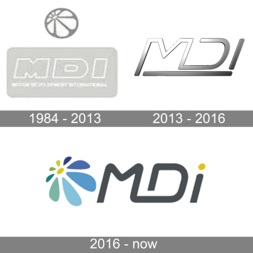
The MDI brand has always leaned towards a more minimalistic logo design. Originally, the logo consisted of a rectangular base with rounded corners that carried the name and tagline in small print underneath. The name featured a bold font and had only a white outline that set the letters apart from the base. Above, there was a round symbol with lines spreading from the upper left corner creating an orange or ball pattern.
2013 – 2016
The updated logo is even more minimalistic. Its clean and stylish design has a futuristic feel. The logo consists of only the brand name printed using a sans-serif font with straight, smooth lines. The letter “M” flows into the “D” and the two share a vertical line. A line underneath completes the picture and creates a more solid image. The logo is done in a metallic silver color palette with darker shades being closer to the bottom and light shining onto the upper left portion of the inscription. There were no other elements in this version.
2016 – now
This logo version is a lot more colorful and has positive notes that hint at the bright future that the technologies created by the MDI company contribute to. The name is printed in a similar style as in the previous version with the first two letters being interconnected. The “I”, though, is done as a lowercase letter with a bright yellow dot above it. This color is supported by a flower-like element to the left. It is done in blue and green shades with a yellow center. It is a colored version of the “ball” seen in the original logo, but the accent is placed on the inside elements, while a gray outline is replaced by a white color that blends with the background.


