Hooters is the name of the American restaurant chain, which was established in Florida in 1983. The main feature of the restaurant is its waitresses, which wear sexy uniforms, with an enlarged company logo on their breasts. Today there are more than 400 Hooters locations worldwide.
Meaning and history
The name of the restaurant chain, Hooters, has a double meaning in English, and both of them are reflected in its logo and the way it is used on the uniforms of the restaurants’ staff members. The first meaning is, of course, “the owls”, while the second is slang one and stands for women’s breasts.
What is Hooters?
Hooters is a famous American restaurant chain, which serves fast food and chicken wings; but is mostly known for its staff. The waitresses of Hooters, known as Hooters Girls, wear revealing uniforms with a huge logo on their breasts.
Hooters was founded by a group of six friends, which did not believe much in the success of the concept. But in literally no time the restaurant became extremely popular among local men. The visitors were coming to just look at young sexy women in shorts and t-shirts and had to order food not to look too foolish. In about a year the company started expanding and opening more locations. Today Hooters is known not only in the United States but all over the world, with almost half a thousand locations in different countries.
Hooters logo is one of the most important things in the company’s concept and recognizability. It was created at the very beginning of the chain’s history and is only slightly modernized by today. The large owl’s eyes are placed directly on the breasts of the waiting staff of the restaurants, showing both of the meanings of the Hooters’ names.
1983 – 2013
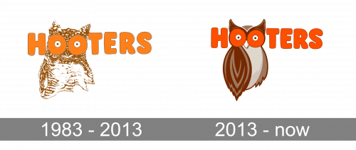
The original Hooters logo was designed in 1983. It was a drawing of an owl executed in a brown and white color palette, with the bold orange logotype overlapping the head of the bird, where two letters “O” were placed at the eyes area. The enlarged orange circles had the negative spaces colored in white and accompanied by smaller brown dots in the middle, which made the “O”s look both like the enlarged caricaturish eyes of the owl and the woman’s breasts. As for the inscription itself, it was set in the uppercase of an extra-bold sans-serif typeface, with the massive letters drawn in solid orange and outlined in brown (the same shade, that was used for the owl drawing). The logo was set on a plain white background, and when placed on the uniform — the t-shirts where it’s printed are also always white.
2013 – Today
The iconic Hooters logo was redesigned in 2013 for the first time. The concept remained absolutely the same, but the contours and color palette of all elements were cleaned and emboldened. The only was redrawn in a modern way. Now it was not only the head of the bird but the whole bird, executed in a brown and gray color palette with some gradients, which made it look more modern and professional. As for the logotype, it didn’t change its disposition and color, but the shade of orange was a bit intensified. The inscription was still set in all capitals of a massive sans-serif typeface, but with the letters more balanced and well-sized now.


