MAZ (Minsk Automobile Plant) is a Belarusian state-owned manufacturer of heavy-duty vehicles, including trucks, buses, and trolleys. The enterprise is overseen by the Belarusian government. Operational since 1944, MAZ is one of the largest producers of heavy vehicles in Eastern Europe. The company has a vast geographical footprint, with its products being exported to over 40 countries worldwide, including Russia, Africa, and Asia. MAZ has been actively involved in collaborative projects with other international companies, working to modernize its production lines and diversify its offerings.
Meaning and history
MAZ was founded in 1944 in Minsk, Belarus, originally as a response to the needs of the Soviet Union during World War II. Over the years, the company has achieved several milestones, including the launch of the MAZ-200, one of the USSR’s most important truck series. In the late 1950s, MAZ also introduced the MAZ-500, which became a key model in Soviet logistics and transport. The enterprise is renowned for its innovation and quality, having garnered numerous awards. Owned by the Belarusian government, MAZ remains an integral part of Belarus’ industrial sector. As of 2021, it has a wide international presence, exporting vehicles to various countries and participating in several international collaborations to stay competitive.
What is MAZ?
MAZ, or Minsk Automobile Plant, is a Belarusian manufacturer specializing in heavy-duty vehicles like trucks, buses, and trolleys. Founded in 1944, it is a state-owned enterprise and is among the largest manufacturers of its kind in Eastern Europe. As of 2021, MAZ exports its products to over 40 countries worldwide.
1951 – 1963
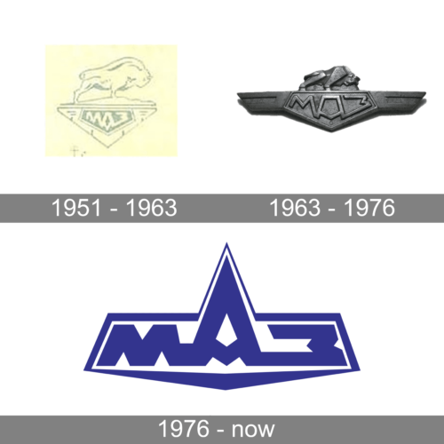
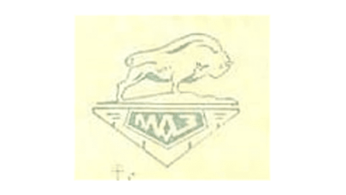
A powerful and determined bull became the symbol of the brand and was used by it for 25 years. It was meant to represent the heavy, large, and strong vehicles created under this brand. Originally, the logo featured just a simple drawing of the bull facing right and an emblem in the form of an inverted triangle. The latter had some lines that created a symmetrical pattern and held a dark pentagon shape with the company’s name printed in Russian using bold characters that filled the shape.
1963 – 1976
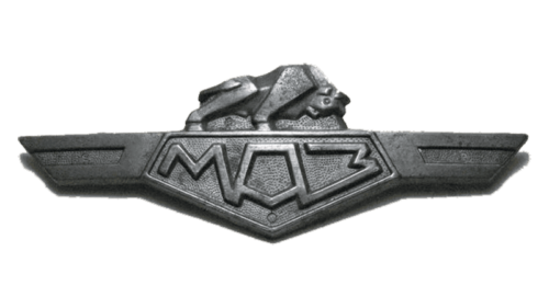
The updated logo looked more worked through and had a three-dimensional appearance. The logo was done in dark gray shades and seemed to be made from metal with all the elements having depth and volume. The bull was still depicted above the name, but it had a more determined position, almost like it was ready for a fight. The pentagon shape with the name remained almost unchanged, but instead of a triangular base, the designers added wing-like extensions on either side that cast a shadow and created a very realistic look. Overall, the logo turned out daring and strong, just like the automobiles developed under the MAZ brand.
1976 – now
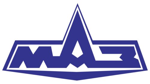
The updated logo looked nothing like the earlier versions. First of all, the iconic bull was gone. In addition, the color was changed to a dark blue with white serving as the base. This logo looked minimalistic and modern. The use of blue color preserved the impression of a reliable and trustworthy brand. Such an impression was supported by the geometric font choice that featured bold, clean strokes with straight cuts and an exaggerated middle letter “A” that had its top go beyond the height of other characters. It looked almost like a grand mountain. The name had a thin border going around it and following its shape. It is worth noting that the company did not introduce an English version of its name, which showed not only a limited market but also its adherence to the original idea.


