Maxus is a Chinese automotive brand specializing in the production of commercial vehicles such as vans, trucks, and buses. Owned by SAIC Motor Corporation, one of the largest automotive manufacturers in China, Maxus was originally a British commercial van marque until it was acquired by SAIC in 2010. The company has a global footprint with operations not only in China but also in Europe, Australia, and parts of Asia and Africa. Known for incorporating cutting-edge technologies and environmentally-friendly features into their vehicles, Maxus aims to establish itself as a leader in the commercial vehicle segment.
Meaning and history
Maxus was initially launched as LDV Maxus by LDV Group in 2004 in the United Kingdom. In 2010, the brand was acquired by China’s SAIC Motor Corporation, leading to its rebranding as Maxus. Over the years, the company has made significant strides in the automotive industry, such as developing electric and hybrid commercial vehicles that have won numerous awards. Their commercial vans are highly praised for fuel efficiency and ergonomic design, often serving various industries like logistics, transportation, and emergency services. Currently, Maxus is diversifying its vehicle lineup, introducing passenger vans and electric minivans as well. They are expanding aggressively in international markets, focusing on sustainability and technological advancements to solidify their position in the competitive automotive sector.
What is Maxus?
Maxus is a Chinese automotive brand specializing in electric vehicles, commercial vans, and utility vehicles. Owned by SAIC Motor Corporation, one of China’s largest automotive companies, Maxus was established in 2011. The company has a global presence, exporting to various countries including the UK, Australia, and several nations in the Middle East and Southeast Asia.
2011 – 2013
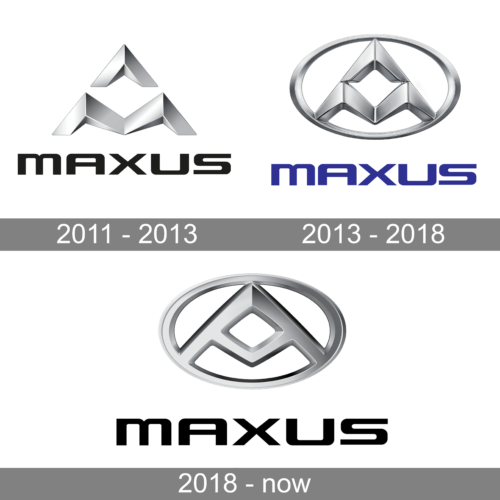
The logo of the Maxus brand consisted of two elements – a stylish metallic silver emblem and a black inscription underneath. The emblem featured a wide letter “M” with an arrow pointing upwards above it, which created an illusion of a letter “A”. It had a three-dimensional and futuristic appearance. Its metallic silver color was easily associated with modern technologies. The inscription underneath featured smooth, thick strokes that formed geometric, all uppercase characters. The black color gave the logo a more sophisticated and solid impression.
2013 – 2018
The symbol from the previous emblem now had an oval frame. It also had the two shapes joined to create a more cohesive look. The designers also changed the silver color to a cooler shade to make it a better match for the blue inscription underneath. Besides changing the size of the inscription in relation to the emblem above and the color, they did not make any adjustments to the font. Although the emblem above now looked more like the emblems of other famous brands, the name and the emblem were unharmonious.
2018 – now
It is interesting that despite making updates to its logo, the automotive brand kept using the same font over and over again. It was surely a successful choice. Most importantly, such a move allowed the company to preserve a recognizable brand image while being able to modernize and improve the log in other aspects. This time, the company changed it back to the black color that went better with a silver emblem above. The latter was slightly redrawn and had a flatter appearance with a rhombus shape in the center. These modifications made the symbol look more polished and modern.


