

![]() Mary Kay Logo PNG
Mary Kay Logo PNG
One of the world’s largest multi-level marketing companies, Mary Kay Inc. boasts a wholesale volume of US$3.25 billion (sixth largest in the world, as of 2018). The company is based in Addison, Texas, outside Dallas. Today, it is still privately owned. The founder’s son is the chairman.
Meaning and history
![]()
The history of Mary Kay started in 1963. It was founded by Mary Kay Ash. By the time she established her company, she already had a 25-year experience of direct selling for other companies. Mary Kay is often named among the best-known glass ceiling breakers of the past. She showed that women can have a rewarding career even though they typically meet by far more obstacles when trying to reach their ambitious aims than men do (at least they did in her era).
Originally, Kay opted for direct selling because she was a single mother raising three children, and thus needed great flexibility and just could not afford to work 9 to 5. Her example has been a great source of inspiration for women around the globe.
1963 – 1967
![]()
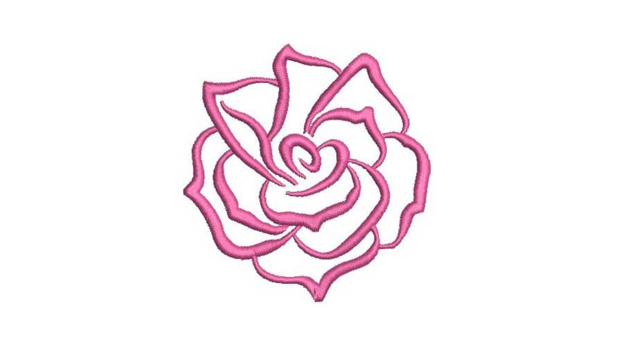
You can also come across other variations of the emblem. For instance, the one with a rose icon. It can be placed either above the wordmark or to the left. Only the “head” of the rose is depicted. It is an open flower having a highly stylized look, with its soft petals going around the middle. The open rose symbolizes the opportunities open for those working with Mary Kay, as well as the beauty promised by the products.
While you can also find a variety of versions based on other typefaces, they do not hold the status of the official Mary Kay logo.
1967 – Today
![]()
The current Mary Kay logo is an example of a simple yet elegant design. On the one hand, you will hardly find anything unnecessary in this pretty minimalistic wordmark. On the other, it is classy and refined due to the tiny nuances.
Font
![]() The design forces behind the brand opted for an elegant, light typeface. While it may look pretty simple, at first glance, in fact, it is refined and unique. One of the most distinctive features is the way the “K” and “A” stick together. Their serifs touch each other, and as a result, the glyphs seem to merge into a single letter. This may appear especially strange if you take a look at all the other letters – none of them form such a glyph, even the “M” and “A” or the “A” and “R,” which have their lower serif positioned in a way that would have made this approach easy to use.
The design forces behind the brand opted for an elegant, light typeface. While it may look pretty simple, at first glance, in fact, it is refined and unique. One of the most distinctive features is the way the “K” and “A” stick together. Their serifs touch each other, and as a result, the glyphs seem to merge into a single letter. This may appear especially strange if you take a look at all the other letters – none of them form such a glyph, even the “M” and “A” or the “A” and “R,” which have their lower serif positioned in a way that would have made this approach easy to use.
Another thing that makes the type unique is the way the “median” elements in the letters are positioned. For instance, the “A’s” have rather low horizontal bars, while the end of the “R” starts rather high. Interestingly, the end of the “Y” also starts rather high, while its end is pretty short. This approach helps to make the logo more compact so as not to let the lower end of the “Y” spread far beyond the line.
The serifs also contribute to the overall effect. They are pretty light in comparison with the width of the strokes forming the glyphs. Also, the serifs have rather thin, delicately rounded ends. The transition from the glyph to the serif forms an attractive curve. We should also point out the “optional” serifs on the tops of the “M” and “R.”
Favicon
In addition to the primary logo, the company also uses a typographical icon. It features the initials of the name of the brand, the “M” and the “K,” typically in red. While the details of the letters are difficult to make out at smaller sizes, the iconic “shoulders” of the “M” are still pretty noticeable.
Colors
The Mary Kay logo is typically given either in black over the white background or in white over the black background. A little more sophisticated version features the lettering in a rose gold tone over the black background.


