Marilyn Manson is the scene name of a popular vocalist and producer, who performs industrial metal music genre. Born in 1969, Manson released his first album in the 1990s and today he is one of the most recognizable musician in the world, due to his unique and controversial image.
Meaning and history
The scene name Marilyn Manson was derived from two most famous American names of the 1960s: beauty icon Marilyn Monroe and evil criminal Charles Manson.
Marilyn Manson established his own art movement, which is called Celebritarian Corporation. And its emblem is an important element of singer’s visual identity. Almost every Manson’s logo features it in one or other way.
1994 — 1996
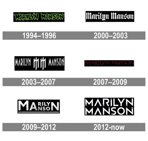
The logo, used by Marilyn Manson in the mid-1990s was composed of a contoured poison-green contoured lettering placed on a black background. The inscription was executed in a custom typeface with the letters dripping, which looked mysterious and unusual for those times.
2000 — 2003

In 2000 the new logo was created for the singer, and this time it was executed more traditionally, though still brilliantly reflected the style of the icon. A white gothic cursive placed on a black background was well-balanced and had its narrowed letters neat and clean.
2003 — 2007
With the redesign of 2003, the emblem of the singer appears between the parts of his name. The white lettering with icons was still executed in white and placed in a black background, but now in all capitals of a custom sans-serif typeface, and separated by two stylized letters “M”, which were enlarged and emboldened.
2007 — 2009

In 2007 the logo becomes dark and aggressive, as the white inscription is replaced by a bloody-red one, and the new typeface of the uppercase wordmark looks dangerous yet very elegant and unique.
2009 — 2012
In 2009 Marilyn Manson comes back to the monochrome color palette and sets his name in a bold and massive sans-serif typeface with the gradient white texture of the letters on a black background again. This time the inscription is underlined and two parts of the singer’s name share the first two letters, “M” and “A”, and the last “N”. The first “M” is slightly enlarged compared to other letters.
2012 — Today
The redesign of 2012 keeps the monochrome color palette, though changes the typeface of the wordmark and adds some small and delicate decorative elements to the tails of the letters. The new logotype is executed in a modern and solid sans-serif typeface with straight clean lines and some “brick-like” ornaments, created by thin black lines.
The Celebritarian Corporation Emblem
The famous emblem is based on The Cross of Lorraine, composed of a long vertical and two short horizontal bars. The symbol was adopted by the Knights Templar in the 12th century AD, and is considered to be one of the strongest alchemist and iconographic symbols.
The Celebritarian Cross has more symmetry in it, and Manson calls it “a double cross”. It usually features monochrome palette of red and black combination, when used on its own.
The Marilyn Manson Icon
The Marilyn Manson icon is composed of two letters “M” in a square geometrical typeface, which unique lettering makes it instantly recognizable. On the icon the Celebritarian across is placed between the letters in fine delicate lines.
It is a very strong logo, full of meanings and symbolism. The Marilyn Manson visual identity is unique and remarkable, reflecting all the sides of the famous artist.


