Manchester City Football Club was created in 1880 as St. Mark’s and adopted its current name in 1894. Currently its home is the City of Manchester Stadium, but until 2003 it played at Maine Road.
Meaning and history
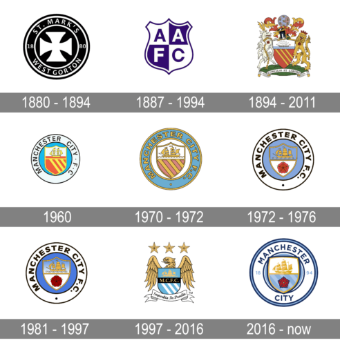
The legendary Manchester City FC was established in 1880 as the St. Mark’s football club and got renamed only in 1894, so the initial logo version of the famous FC was designed for the team with another name. Though starting from 1894, the club was building its visual identity solely around the historic Coat of Arms of the city of Manchester.
1880 – 1894
The insignia of St. Mark’s FC was composed of a heavy monochrome circular badge wide frame, formed by a double white outline. In the middle of the emblem, there was a bold white Cross placed on black and creating a strong contrast. Between two circles of the badge’s outline, the white wordmark was located — “St. Mark’s West Gordon” in all capitals of an easy sans-serif typeface was written around the logo’s border, halved into two parts by the “1880” date mark.
1887 – 1994
The logo, used by the football club from Manchester in the end of the 1880s was executed in a blue and white color palette, with the main element in a shape of a traditional crest. The badge was divided into four segments, with the four letters, “AAFC” placed on them. The blue letters were set in white fragments, and the white ones — on the blue squares. The badge stayed active for seven years.
1894 – 2011
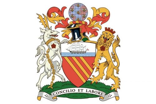
After the organization of Manchester City FC, the club embraced an official Manchester coat of arms as its main logo. And this striking heraldic image was used until the beginning of the 2010s, being the main or additional insignia.
The coat of arms was composed of an orange shield with three yellow oblique lines on it. The upper part of the shield portrays a clipper placed on a white and blue background. The shield sits on green grass and is surrounded by animals — a white deer on the left and a golden lion on the right, implemented by curvy orange and yellow vignettes on top and a globe in the pale blue and pink palette.
The 1960s
The simplified edition of the heraldic logo was introduced in the 1960s. The orange and yellow shield was placed on a light blue background and encircled in a thick white-and-black circular frame with a black sans-serif inscription around its border. The clipper on this emblem was also executed in yellow and placed on a white and orange background.
1970 – 1972
In 1979 the logo was redesigned again. All patterns were modified and the color palette was shifted to a more enthusiastic one, making the framing light blue and the wordmark — gold in a black outline. As for the main part of the insignia, the shield, it got modernized, and now the lines were bolder and more balanced, as well as the clipper, put on a white background with wavy yellow lines.
1972 – 1976
A red rose appeared on the shield in 1972, replacing the diagonal lines. Now the shield, outlined in gold, was placed on a light blue background and featured a bold sans-serif lettering in a modern and massive typeface around the white frame’s perimeter. The yellow clipper was also placed on a blue background, which looked tender and elegant.
1981 – 1997
The tones of the logo have been enriched in 1981. The shield gained gradient blue and white shades, which added volume and style to the emblem, and the background of the internal circle became a bit brighter than on the previous version. The wordmark and a solid black dot in the bottom of the frame remained unaffected.
1997 – 2016
The club decides to change its logo again in 1997. It was a new concept, adopted by the team, which stayed with them for almost twenty years and is assumed to be one of their most well-known logos.
The blue shield with three white diagonals was placed on the body of the golden eagle, who had its head turned to the left. Above the eagle, there were three five-pointed stars in gold, placed to celebrate the club’s winnings and trophies. Under the shield a white curved ribbon with the club’s motto was placed, where the “Superbia In Proelio” in an old-style cursive was written in black.
As for the crest itself, it maintained its main elements — stripes and a clipper, but now they were separated by a bold black line with “M. C. F. C.” Abbreviation in gold serif on it.
2016 – Today
In 2016 Manchester City decides to come back to the version of the 1990s, returning the rounded badge and a red rose. The shield in a double blue and gold outline featured the clipper in gradient gold and a red rose on a blue striped background. The wordmark in royal blue is placed around the edge of the circular frame, executed in a modern and solid sans-serif typeface. The “1894” date mark is positioned horizontally on the frame, using a light blue shade.
Current emblem
The 1997 badge received a lot of criticism from the team’s fans, so it was only natural that the club changed it less than 10 years after it was introduced. Shortly before the new logo was created, the club had consultations with their fans about what it should look like.
The current logo was unveiled at the end of 2015. In fact, it looks more like the older ones than the 1997 logo. Again, we see the familiar round shape. The image somehow resembles logos of other clubs belonging to City Football Group. Inside, there is a shield, where a golden ship and the red rose of Lancashire are placed.
Font
The sans-serif all-cap typeface used in the current version of the Manchester City logo looks clear and minimalistic.
Color
The team’s home colors are light blue (often referred to as sky blue) and white. We may also point out that the away kit color palette is different and includes maroon or a combination of red and black. There is no information as to when and how these colors were chosen. The only thing that is clear is that blue has been used in the footballers’ outfits since 1892 or earlier.
Manchester City Colors
SKY BLUE
PANTONE: PMS 292 C
HEX COLOR: #6CABDD;
RGB: (108, 171, 221)
CMYK: (55, 16, 0, 0)
BLUE
PANTONE: PMS 281 C
HEX COLOR: #1C2C5B;
RGB: (28, 44, 91)
CMYK: (100, 90, 33, 29)
GOLD
PANTONE: PMS 135 C
HEX HTML COLOR: #FFC659;
RGB: (255, 198, 89)
CMYK: (0, 21, 76, 0)
DARK GOLD
PANTONE: PMS 7555 C
HEX COLOR: #D4A12A;
RGB: (212, 161, 42)
CMYK: (0, 28, 98, 11)
RED
PANTONE: PMS 485 C
HEX COLOR: #EC3325;
RGB: (236, 51, 37)
CMYK: (0, 78, 84, 7)


