Maldita Vecindad is one of the Mexican and Spanish rock pioneers, the band, debuted in the middle of the 1980s and still reflects the most actual aspects of both the social and cultural life of their country.
Meaning and history
The band, consisting of four musicians, was formed in Mexico City in 1985, and released their first album only three years later, in 1988. It was an LP, which brilliantly represented the unique style of the band, which mixed several genres, but always based its tracks on national Mexican music.
The most famous album of Maldita Vecindad, El Circo, was released in 1991. And it was the beginning of the incredible popularity of the band, which covered various very sharp and important aspects in their tracks. Thus, in the album Mostros, which saw the light in 1998, Maldita Vecindad recorded tracks, dedicated to the Tlateloco Massacre, which happened on October 2, 1968, and was a major milestone in police brutality in Mexico. It is about the impunity that this action has until today that the band sang their songs with social criticism.
What is Maldita Vecindad?
Maldita Vecindad is the name of the Mexican musical band, which was established in 1985 and performs in a unique style, mixing the traditional music of its motherland with rock motives. The band is composed of vocalist Roco, guitarists El Pato and Sax, bassist Aldo, and drummer Pacho.
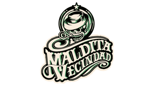
In terms of visual identity, Maldita Vecindad has been very loyal to the iconic logo, designed for it at the end of the 1980s. And even though, for some of the albums there were different images created, the one, released in 1989 has never been replaced from its pedestal. Moreover, the iconic logo of Maldita Vecindad was even copied by another Mexican musician in 2017, which caused a wave of scandals in the press.
1989 – Today
Maldita Vecindad released the logo for their compilation album Maldita Sea Vol. 1: 1989 – 1999. The logo was designed by Mr. Cartoon, one of the most renowned tattoo artists in the world, and it would be the band’s record label that would do the commissioning. The iconic badge, set in a black-and-white color palette, is composed of a stylized two-leveled script lettering, which can sometimes be used on its own, and sometimes — accompanied by a roundel with a funny skull in a hat, drawn in the same style as the wordmark.
Font and color
The unique lettering from the Maldita Vecindad logo is not a wordmark, but a drawn creation of a tattoo artist, hence there are no commercial analogs to this typeface, even though the capital letters featured wishbone contours, and some of the letters have their bars elongated and curved.
As for the color palette of the Maldita Vecindad visual identity, it is based on the combination of white and black, which makes it possible to place the logo on intense colorful background, and the band uses them a lot, as Mexico and its music are all about the brightness and intensity.


