Macquarie University is the name of one of the most reputable universities in Australia, which was established in 1964 in Sydney and today has almost 50 thousand students and two thousand academic staff.
Meaning and history
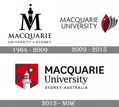
Macquarie claims itself as a progressive and innovative university, and the history of its visual identity proves that it’s true. The logo of the University has been changed three times, and each of the versions is stronger and more contemporary than the previous one, though the current version is a combination of the first two emblems.
1964 – 2009
The very first logo for Macquarie was under by the university until 2009 and featured a stylish “M” with a lighthouse tower as an emblem. The wordmark, set in two levels, was placed under the emblem and written in a classy serif font with elongated tails of “Q” and “R” for the upper part, and a laconic and simple sans-serif for the “University Sydney” lone, where the two words were separated by a horizontally elongated “~” sign. The logo was executed in a monochrome color palette and looked truly outstanding.
2009 – 2015
The redesign of 2009 brought a completely new concept to Macquarie’s visual iden-tity and add196ed new shades to its color palette. The wordmark in this logo was exe-cuted in a lightweight geometric sans-serif typeface in black, and the new elegant and smooth emblem in burgundy and gray was placed on the right from the lettering. The new emblem featured grout overlapping leaves, where the upper one was in burgundy-pink, and three others — in two shades of gray. The white small Star was placed on the upper level, resembling the star above the lighthouse on the previous logo.
2015 – Today
The current Macquarie University logo combines the symbol from the first version with the color palette of the second, placing a gradient white lighthouse with the star on a strict crest with a geometric red and purple triangular pattern. The wordmark in two levels and two different styles are set in black under the emblem.
The seal of the university, which is the base for the current version, has a dark green background and a white image of the Macquarie Lighthouse with a gold Sirius Star above it.
Font and color
The current Macquarie University wordmark has its upper part in the capitals written in a modern sans-serif typeface, which is very similar to Bruta Global Regular Semi Bold, but with the letter “Q” modified. As for the bottom level, written in the title-case, it uses a traditional and sophisticated serif font, the one, close to Lucida’s family fonts.
The intense and bright color palette of the University’s logo, composed of red, purple and white, is a reflection of progress and passion for learning, along with the loyalty and transparency of the education and research organization and its professional and fundamental approach to all the processes.


