Simple as it is, the Macmillan logo looks recognizable, modern, and unique, with its clear and sleek typeface and distinctive colors.
Meaning and history
Macmillan Publishers Ltd was established in 1843 by two brothers. Today the company is the property of Holtzbrinck Publishing Group.
What is Macmillan?
Macmillan Publishers is the name of one of the Big Five English language publishing companies, which was established in Great Britain in 1843. Today Macmillan publishes books, magazines, and academic journals, and has a yearly revenue of about 1,4 billion USD.
1881 – 1884
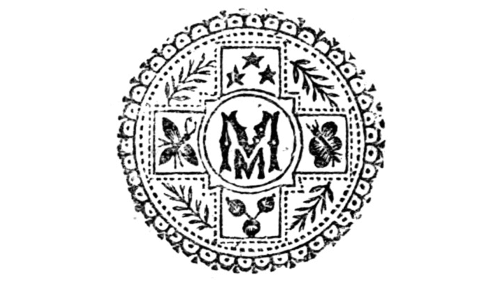
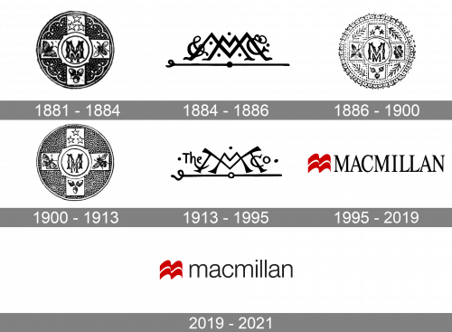
One of the earliest logos could be seen in the Leslie Stephen’s biography of Alexander Pope published in 1880. That was quite an intricate emblem featuring two letters “M” (the smaller one behind the bigger one), the ampersand symbol and the letters “Co”. Also, there were three dots. The logo was placed inside three rectangular frames: two thinner frames inside and a bolder one around them.
1884 – 1886

In 1884, they introduced a new design. Like before, it featured two ‘M’ letters of different sizes: one wide and short, and the other tall and narrow. They were written in more-or-less the same space, spiced up with some decorative dots and given a few more illustrative elements.
1886 – 1900

In a few years, they returned to the old round print. This time, they mostly used white, and black was reserved for lines and whatnot. There were also illustrative additions, such as the round elements alongside the edges.
1900 – 1913

Then, they decided to scale the darkness back up. Much of the background now looked black, and it actually consisted of many small, white circles. Their edges are what made up this thick black space.
1913 – 1995

For much of the 20th century, the company used the 1884 design (the one with letters as a center piece), but with a few changes. Notably, their style was now less strict and more comical. Most of the other elements persisted, although there were now words like ‘the’ & ‘co’ on the left and right respectively.
1995 – 2019

The new 1995 logo is much simpler – it’s just the company name written in capital serif letters, colored black. They are joined by a little red emblem that looks like a flag with a little white line in the middle.
2019 – 2021
The logo includes two parts: the emblem and the wordmark. The emblem itself depicts a stylized open book, but it also resembles sea gulls or waves. The image may be given as 2D or 3D depending on whether it is placed on digital media or books. Next to it, there is the word “Macmillan” in lowercase letters. Below it, the name of the company division can be seen (Macmillan Publishers, Macmillan Learning or Education).
Prior to the current emblem, the one with capitalized letters was used. The typeface was also different: it was a more old-school serif font.
Font
The typeface is sleek and modern. The rounded sans serif font does not boast uniqueness yet is perfectly legible.
Color
The current Macmillan logo features a red emblem, black and red letters, and a grey vertical line between them. All these are placed against the white background.


