Lugano is the name of one of the oldest football clubs from Switzerland, which was established in 1908 in Lugano. Today the club, managed by Maurizio Jacobacci, is considered to be one of the strongest among all Swiss teams.
Meaning and history
The Swiss football club, founded at the beginning of the 20th century, hasn’t had many logo redesigns throughout the years, but each of their emblems was created with elegant restraint and sophistication.
The 1960s
In the 1960s the club was using a rounded badge, which was all black and featured a double gold and black outline. The “FC Lugano” in all capitals of a modern and smooth sans-serif typeface was placed on the black frame, along its bottom part.
The “LF” monogram, in a custom font with elongated and arched lines, was outlined in a stylized letter “C”, which created a second circle on the badge. All the elements were colored dark gold and looked chic and mysterious.
Today
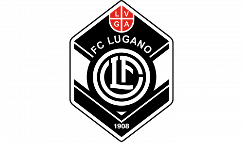
The Lugano logo we all know today is completely different from the previous version. Now it features a hexagonal badge in monochrome, with a rounded red shield in its top corner. The shield is divided by white lines into four parts, where the “LVGA” letters are written in white.
The main body of the badge boasts a chevron pattern in black and white and the rounded badge from the 1960s, which is now executed in monochrome. The “1908” delicate mark in white is placed on the bottom part of the emblem.


