

![]() Lucky Brand Logo PNG
Lucky Brand Logo PNG
Lucky Brand Jeans is a denim company headquartered in Vernon, California, US. It was established in 1990 by Gene Montesano and Barry Perlman. It filed for bankruptcy in the summer of 2020.
Meaning and history
The Lucky Brand logo has gone through more than one modification over its comparatively small history. We can mention several elements that have been part of the visual brand identity over various periods.
Clover/Asterisk
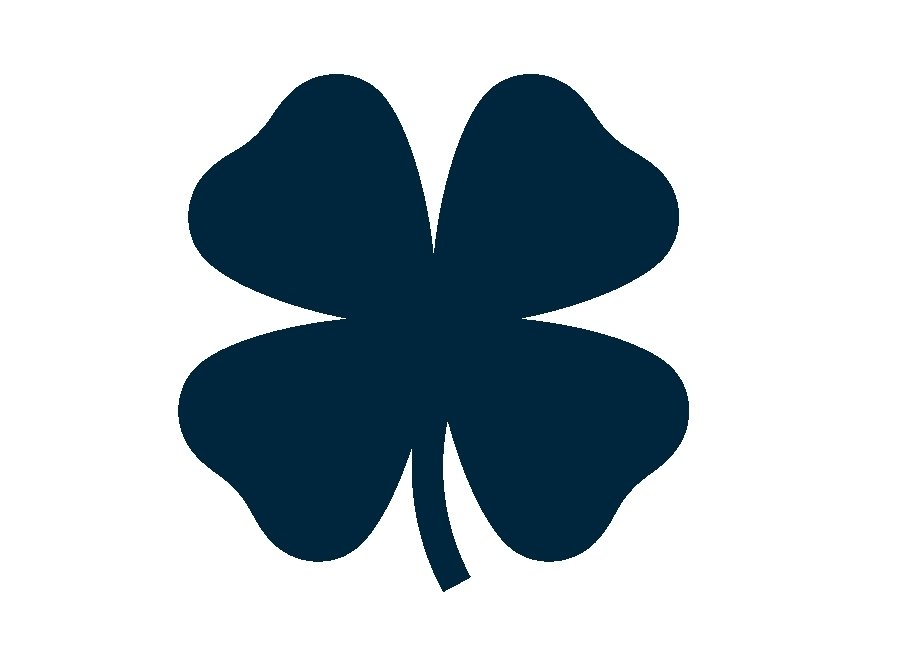
In many versions, you can notice a dark blue clover with four petals. It is stylized and looks like an asterisk but has a tiny stem hinting at its botanic origin.
The dark blue color was inspired by the color of denim. This creates a link with the product making the logo meaningful.
In addition to being paired with the wordmark, the clover has been often used as a standalone emblem. For instance, it is the icon on the brand’s website (as of 2020).
“Denim” logos
![]()
Probably the best-known versions were the dark blue ones (the same colors as the clover icon). There was a version where the name of the brand was set within a single line and featured the clover between the two words. Below, there was the lettering “Est. 1990” in smaller glyphs.
Also, you could come across a version where the word “Lucky” is above “Brands.” In this case, there are two clovers, one of them to the right, the other one to the left.
Handwritten wordmark
Another popular version showcased the name of the brand set in a decorative script imitating handwriting. The glyphs combined strokes of very different width, from very thin to very bold, which added an elegant touch. The end of the initial “L” stretched below the whole wordmark.
This version of the Lucky Brand logo was white, which didn’t convey any message.
Monogram
![]()
The “handwritten” mark had a shortened version where only the “L” and “B” were left. Like in the full logo, the lower end of the “L” was extended. Yet, here it formed a full circle around both the letters.
Brown wordmark
As of late 2020, the website features a much simpler wordmark. The type is an austere sans looking as an antipode to the white “handwritten” mark. The glyphs have classic proportions and are rather light. They are perfectly legible even in smaller sizes.
Font
The brand has used several fonts in its logotypes. The elaborate cursive wordmark it used in the past was eventually replaced by the strict sans of the 2020 wordmark.
Colors
The older versions of the Lucky Brand logo showcased a dark blue shade inspired by the color of denim. The brown color of the modern logo is a complementary color for one of the most popular denim hues. Complementary colors always emphasize each other, so this choice of the palette seems beneficial for the brand.


