The logo of the Swiss luxury watchmaker Longines has gone through more than ten updates since 1889 when it was registered. And yet, there’s an element that can be seen in the majority of the versions.
Curious to find out what this element is? Then take a look at the Longines watches logo timeline.
Meaning and history
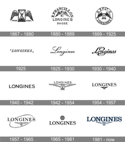
1867 – 1880

An hourglass with wings became the trademark of Longines. In fact, the “Trademark” inscription was added on either side of the hourglass. This emblem became a seal that protected the company from counterfeit products and has been used by the company for over a century. In fact, it is one of the longest unchanged trademarks.
1880 – 1889
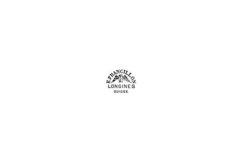
The original logo was accompanied by the founder’s first name initial and last name. It was arching above the symbol, while the company’s name was printed across the bottom. In a smaller font underneath, the company has added “Suisse”, which is the French name for Switzerland.
1889 – 1925
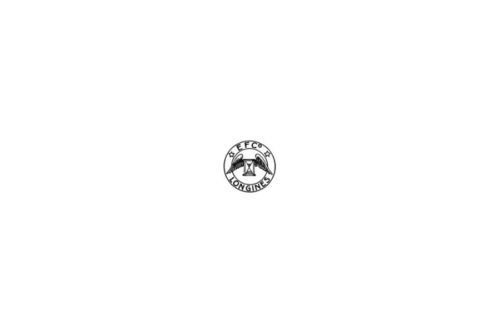
The company used the original emblem as the base again and added a double circle around it. At the top, the border had EFCo, which stands for Ernest Francillon & Compagnie. The company name was printed at the bottom using the same sans-serif font and capitalized letters.
1925
For a very short period of time, the company used its name without the winged hourglass. It used all uppercase letters with straight, clean lines, and bracketed serifs. The word was italicized, which added a feeling of movement and progress. In addition, they placed “Longines” in quotation marks. The logo looked traditional and formal.
1925 – 1930
This version was used for five years. The designers chose an elegant, stylish cursive typeface. Only the first letter, which had graceful swoosh strokes, was capitalized. This version creates an image of a luxurious and sophisticated brand.
1930 – 1940

This is the longest the company has gone with the same logo without its hourglass symbol. This logo has a very similar style to the previous one. One of the major differences is the thickness of the strokes. The thicker lines created a more solid brand image without having the logo lose its luxurious feel. The font has been changed but it has a very similar cursive style of writing, preserving the recognizable brand image.
1940 – 1942
This logo reminds of a logo introduced more than a half-century ago in 1940. The company used only its name for the logo, which has become a trend in the last few decades. The inscription had straight strokes and cuts along with closely spaced, all uppercase letters to add seriousness and create an image of a well-established brand.
1942 – 1954
It has been almost 20 years since the company abandoned the use of an hourglass with wings in its logo. It brought it back but gave it a complete revamp. The wings looked more abstract and their elongated shape not only served as the base for the name but also created a more dynamic image as the hourglass looked like it was flying. The name was printed using a font very similar to the one featured in the previous logo. This and the fact that the company brought back the original symbol reinforced the trustworthy and well-recognized brand image.
1954 – 1957
In this logo, the accent was placed on the brand name. The inscription was significantly enlarged and looked more sophisticated. It was achieved by giving the characters a different thickness of strokes and serifs. The logo turned out a perfect representation of an acknowledged brand.
1957 – 1965
A few modifications were done in 1957. The most obvious change was the addition of an ellipse that added a feeling of movement inherent to watches. The designers the winged hourglass slightly larger but it still had a secondary position as the characters in the name got more spacing between them.
1965 – 1981
A small round symbol above the name replaced the hourglass and created an association with the round watches. It had a lot of details with a globe pattern in the center and a striped border. The spacing between the letters was smaller again. The overall image reminded of the logo created in 1954 with the only difference being the different placement of the symbols. Although the symbols were different, approximately the same size allowed to draw a connection between the two.
1981 – Today

For the first time in history, the brand used a color that was not black. Although the deep blue was very close to the black, it marked a new stage in the history of the brand. The company brought back the winged hourglass, placing it underneath the name. Although the font was kept unchanged, the designers played with spacing once again, placing the letters quite close. In addition, they made them not as tall, which boosted the strong and well-established position of the brand.
Can you see the winged hourglass? The company registered it with Switzerland’s Federal Office of Intellectual Property in 1889. Also, the name and logo were registered with the World Intellectual Property Organization in 1893, and according to the brand, Longines is the oldest unchanged, still active trademark registered with the WIPO.
Emblem
The structure of the symbol is simple – just an hourglass with two wings. On the earliest version, which was introduced in 1860, the wings had pronounced curves on the top, while the ends were pointed down. The same approach could be seen in the following two versions the watch brand Longines introduced in 1867 and 1889 respectively.
From 1900 to 1941, the company used a wordmark emblem without any pictorial elements. Eventually, in 1942, a new period started in the Longines logo history. It was then that the winged hourglass made a return to the emblem. While the logo has been modified at least four times since then (in 1954, 1957, 1965, and 1981), it has always been built around this symbol.
Font
The all-caps sans serif type seen on the Longines logo looks very similar to Clarendon Regular designed by Hermann Eidenbenz.
Colors
The dark shade of blue creates a distinct contrast with the white background.


