Loganair is a Scottish airline operating scheduled and charter flights. The company, owned by the Loganair Group, has a rich history dating back to 1962 and is headquartered in Glasgow, Scotland. With its extensive network, Loganair serves various destinations within the United Kingdom, including remote and rural areas, as well as international routes to Ireland, Norway, and the Isle of Man. The airline is known for its commitment to providing reliable and efficient services, connecting passengers to both popular and less accessible locations across its network.
Meaning and history

Loganair is a prominent regional airline operating in the United Kingdom. Established in 1962, it has a long-standing history of providing reliable air services to various destinations. The airline primarily focuses on serving remote and island communities, connecting them with major cities across the UK and beyond. With a fleet of modern aircraft, Loganair offers a comfortable and efficient travel experience to its passengers. The airline is known for its commitment to customer satisfaction and safety, ensuring a seamless journey for travelers. Loganair’s extensive route network covers a wide range of destinations, including scenic and remote locations that are often underserved by larger airlines. With its dedication to quality service and community connectivity, Loganair continues to play a vital role in facilitating regional travel and fostering economic development in the areas it serves.
What is Loganair?
Loganair is a regional airline based in Scotland. It operates scheduled flights to various destinations within the United Kingdom and Ireland, as well as some European destinations. The airline has a long history dating back to 1962 and is known for its reliable service and commitment to serving remote and rural communities.
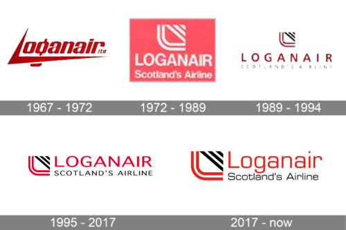
1967 – 1972

Surprisingly, the oldest LoganAir badge looked the most modern and bold of all, designed for the air carrier throughout its history. It was stylized dark-red lettering with the elongated and sharpened bars of the “L”, which were framing up the whole wordmark.
1972 – 1989

The redesign of 1972 created a more traditional logo for the airline. Now the white lettering was accompanied by an abstract geometric emblem, and set on a smooth pink rectangular background. The name of the air carrier was underlined by “Scotland’s Airline” in the title case.
1989 – 1994

The emblem from the previous version, composed of the “L”, formed by two parallel lines and a triangle, making up a square, was redrawn in a red and black color palette, while the inscription was rewritten in a more geometric sans-serif, in dark red, and the background turned white.
1995 – 2017

The contours of all elements were refined in 1995, while the shades of the color palette became brighter and cleaner. The rewritten logotype got placed on the right of the emblem, and underlined by “Scotland’s Airlines” in small black capitals. The logo looked very modern and professional.
2017 – now

The redesign of 2017 has enlarged the emblem on the LoganAir badge and rewritten the lettering in the title case, as well as the tagline, which made the whole logo look more traditional and elegant. The color palette remained untouched.


