The Spanish fashion brand Loewe is known for its leather goods, clothing, and perfumes, as well as accessories. It is based in Madrid, Spain. It is the oldest luxury fashion brand owned by LVMH.
Meaning and history
The history of the brand can be traced to 1846.
Loewe is a Spanish luxury fashion house, one of the oldest fashion brands in Europe, specializing in leather goods, clothes, perfumes, and other fashion accessories. The company is headquartered at Place Saint-Sulpice in Paris, its production facilities are located in the suburbs of Madrid.
German craftsman Heinrich Loewe Rössberg came from Kassel to Madrid, opened a small workshop, and met José Silva and Florencio Rivas, who had been running a workshop for fur and leather goods since 1846.
In 1872 he and his two new buddies founded E. Loewe S. A. (“E” for “Enrique”, as this is what Heinrich was called in Spain). That same year, Loewe opened his first leather goods store in Madrid. Despite this fact, the year the company was founded is considered 1846, when the original fur and leather goods workshop was opened by Silva and Rivas.In 1892, E. Loewe moved to Madrid Principe street and began to gain fame among the general public.
Today this brand is synonymous with luxury fashion. Its accessories, footwear, and clothing collections become iconic and can be seen on the most famous celebrities in both Europe and the USA.
What is Loewe?
Loewe is the name of a luxury Spanish fashion house, which was established in 1846 in Madrid, and today is part of the LVMH luxury group, being its oldest brand. Loewe is known for the production of leather goods, clothing, accessories, and perfume for men and women.
1846 — 2014
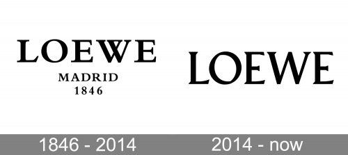
If you compare the old Loewe logo with its 2012 reincarnation, you will notice several similar details. The letters still have that traditional touch – the serifs, the classic proportions, and the varying thicknesses of the glyphs. This, of course, doesn’t mean the two versions are identical.
In the old logo, the type is a true vintage one. It emphasizes the brand’s heritage. Due to the fact that the name of the brand is given in large glyphs, you can clearly see every detail of the wordmark, from the classic serifs to the intricate middle part of the “W,” which would have been almost unimaginable in a typical modern logo with its minimalism.
Below the name of the brand, there is the lettering “Madrid 1846” (the year, when the brand was founded). This part supports the “heritage” theme.
We should also add that, in addition to the wordmark described above, the company used a sort of stamp placed on Loewe’s products, which featured four intertwined “L’s.” It was created by Vicente Vela somewhere in the 70s-80s, when the brand was successful in establishing its presence in various places in the world, including Tokyo, Hong Kong, and London.
2014 — present
The updated version preserves the “heritage” theme by using a serif typeface with a conspicuous variation in the thicknesses of the glyphs. And yet, the wordmark doesn’t look dated. That’s because each glyph has a subtle artistic touch that would have been impossible several decades ago. For instance, the “O” has its symmetry axis tilted to the left. Also, the place, where the two halves meet, isn’t smooth, like in traditional typefaces.
The signature lower strokes in the “L” and “E’s” look identical and create a visual rhythm. They are nothing like the old-fashioned traditional serifs.
In addition to the wordmark, the company also has a new version of its “stamp” pattern. It looks exquisite and refined and consists of four highly stylized, swirly “L’s.”
The 2014 Loewe logo was created in collaboration with Michael Amzalag and Mathias Augustyniak, the art and design duo of the Parisian agency M/M (Paris). It is also mentioned that the inspiration for the logo came from Berthold Wolpe, a German-born British typographer.
Font
While the font is unmistakably modern, it definitely draws inspiration from the brand’s rich heritage. In other words, Loewe is trying to preserve its heritage and appeal to its loyal customers, while also being in line with current design trends and trying to reach a younger audience.
Colors
The color of the packaging was changed to the new smoky white Humo color. The Loewe logo is still black with a white background – a common choice for a fashion brand, which allows perfect flexibility and adaptability to various visual contexts.


