![]() Linde Logo PNG
Linde Logo PNG
Linde Company was founded by an inventor Carl von Linde in 1879 in Wiesbaden, Germany starting with the production of a mechanical system of refrigeration. In 1907, the firm established a subsidiary, Linde Air Products, in the USA and attracted new investors. Nevertheless, after the defeat of Germany in the world war, the subsidiary was expropriated and included in the Union Carbide Corporation; only in 1992, it split from the Corporation to become an independent Praxair Company.
The year 1999 was important for Linde as it regained the right to use its brand in the USA market. Meanwhile, Linde acquired AGA gases company of Sweden and extended its operations to Northern Europe and the Americas. In 2018, Praxair Inc. and Linde AG announced their merger. The new company, Linde plc, is the world leader in the field of industrial gases supplies and engineering. In 2018, its sales reached a level of 28 billion US dollars. It has about 80 thousand employers worldwide and serves clients in more than 100 countries.
Meaning and history
![]()
Linde plc is a chemical company based in Guildford, Surrey, United Kingdom. It appeared as a result of the merger of Linde AG (Germany) and Praxair (the United States). Linde is the largest industrial gas company in the world by market share and revenue.
1938 – 1998
![]()
You can come across a vintage version of the logo where the wordmark is slightly different. The most notable modification is the “L” (its upper curve, to be precise). The curve in the old logo is much more pronounced, it almost forms a spiral. The other letters have subtle differences from the current wordmark, too. For instance, the dot above the “i” used to look squarish in the previous logo, while the “e” had a longer tail.
![]()
The company’s print materials released in the 1900s showcase the writing “The Linden Air Products Co” in a plain sans.
1998 – Today
![]()
The redesign of 1998 has modernized the contours of the letters in the Linde logotype, with the tail of the “L” getting straighter, but keeping its elegance and playfulness. The lowercase characters also got stricter and more traditional, but this didn’t make the badge less interesting or stylish.
2019 – Today
![]()
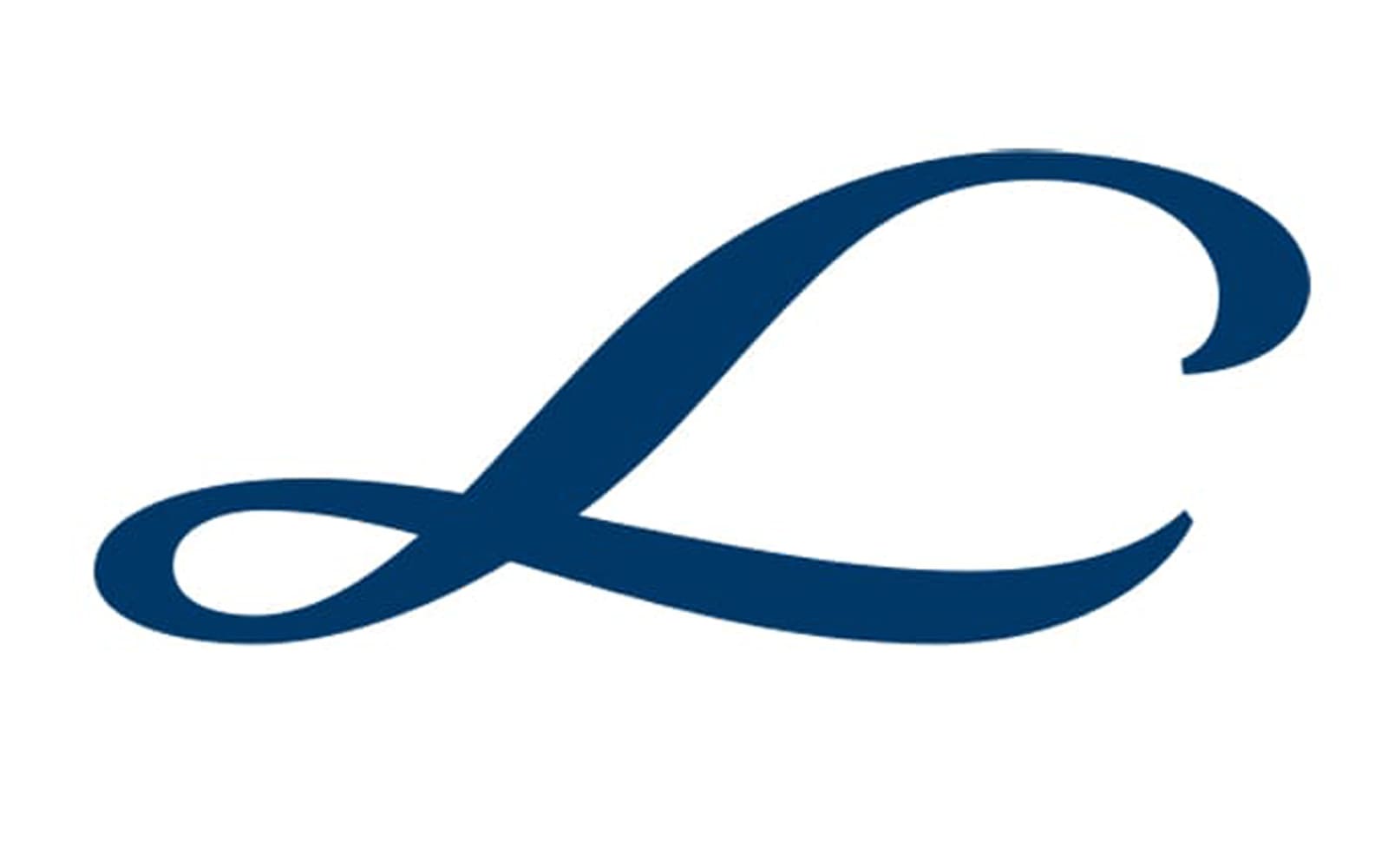
The current Linde logo showcases the word “Linde” in a beautiful script imitating handwriting. The “L” is especially notable for its picturesque extended end. All the glyphs have a calligraphic touch.
The full version of the logo also includes the dark blue background and a stylized 3D curve in a lighter shade of blue. Both the blue curve and the shape of the “L” symbolize gas, which is one of the two main areas for the company.
![]()
The logo of the Linde Group features the same “L” paired with the lettering “The Linde Group” in a much simple sans.