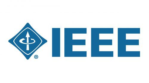
The logo of the professional association IEEE has remained unchanged ever since it was adopted in 1963. The current IEEE logo was developed on the basis of the emblems of two IEEE’s predecessors.
Meaning and History
The history of the organization started in 1884, when its predecessor, American Institute of Electrical Engineers, was founded. The abbreviation “AIEE” could be seen on its first logo, which was introduced in 1892. The emblem had the shape of Benjamin Franklin’s kite. The outline was formed by the legendary Wheatstone Bridge, the device invented in 1843.
At the very center of the design, a galvanometer could be seen. The device had a blued steel compass needle and an amber disc placed over it. To add one more hint as to what field the organization worked in, Ohm’s law was included in the design. Interestingly enough, the “C” in the Ohm’s law was bigger even than the name of the institute – something impossible for a modern logo. Such detailed and straightforward logos were standard at that era, though.
And yet, as soon as in five years, the AIEE decided to adopt a completely different emblem. This one was way simpler than its predecessor. While the shape was still inspired by Franklin’s kite, it was now more symmetrical. The initials of the organization’s name were more extensive and more legible. The two “E’s” were placed inside two interlocking circles. According to the official legend, the meaning behind the logo was as follows: electricity surrounding magnetism and magnetism surrounding electricity.
Symbol
When the Institute of Radio Engineers was established in 1912, it adopted a triangular logo with rounded corners. The two arrows placed at the center referred to the same concepts – magnetism and electricity.
The 1963 emblem
In 1963, the IRE and the AIEE merged to form a single corporate entity. As far as the new organization aimed at uniting engineers from many countries, the word “American” was removed from the name. At this point, another problem arose – the abbreviation “IEE” was already used by the Institution of Electrical Engineers in the UK. Eventually, the merged organization was named the Institute of Electrical and Electronics Engineers.
As the official version of the corporate history explains, the new logo was created and approved fairly quickly. Like the organization itself, it was the result of the merger of the old AIEE and IRE logos. Once again, you could see Franklin’s kite, this time with a slightly modified shape.
The visualization of the right-hand rule of electromagnetic forces borrowed from the old IRE emblem was simplified, while the electrical current arrow was now pointing in the upward direction.
Bernard M. Oliver, who was a member of the Merger Committee at the time, drew the IEEE logo right during the meeting.
While the older versions contained acronyms, the new one deliberately didn’t include the lettering “IEEE” in the kite but placed it to the right. To begin with, this helped to make the logo more universal as it could be easily represented in any other language. Also, the design became stronger and less cluttered.
So far, this has been the final step of the evolution of the IEEE logo.
Font
While the primary corporate typeface is Formata, the logo features a different font. Like Formata, it’s a sans serif type, but it has more straightforward square glyphs. It doesn’t look unique or creative, yet conveys the concept of professionalism and reliability due to its simple shapes.
Some of the fonts looking very much like the one on the IEEE logo are Bitmapper OLD TYPE Regular, Interval Sans Pro Black, Micro Square Extra Bold, and Clio XS Ultra Black.
Colors
The shade of blue used as the corporate color is Pantone 3015 C (PROCESS: C100 M31 Y5 K20), according to the official brand identity guidelines published in the summer of 2017. When it comes to web-safe and RGB equivalents, which can be used for websites or other digital applications, the company recommends the following shade: RGB: R0 G102 B161 and hex: #006699. As for the black and white, these are the classic versions: hex: #000000 (black) and #FFFFFF (white).
The guidelines don’t allow representing the primary logo in other colors than the three mentioned above.


