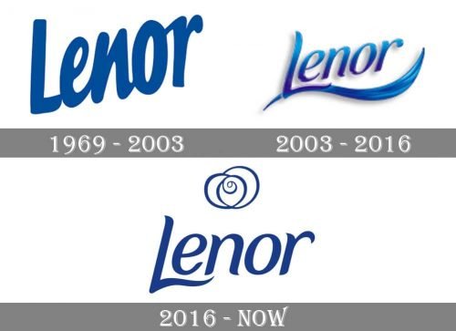
Although the Lenor logo has undergone not less than three updates since 1969, it has preserved the original color, blue. It has been used as a symbol of cleanness. The product is sold in the United States as Downy and has a somewhat similar logo.
Meaning and history
The brand’s first product was a laundry conditioner, which helped restore clothes to their former appearance and also made them surprisingly soft. The product quickly became popular, because at that time it had no worthy equivalents. The specialists of the brand began to improve the formula, due to what the product acquired new properties. Today the conditioner from Lenor makes the laundry fresh and soft, takes care of the fabric and prolongs its lifetime, facilitates ironing and serves as antistatic.
Gradually the brand expanded production, and its range was replenished with new products. Today on the shelves there are special conditioners from Lenor for white, black and colored linens, wool and cashmere, and rinse aid. Products of the brand can be used for both hand and machine washing. All Lenor products are created under the motto of Procter & Gamble itself – caring about the customer. Thanks to this, the company’s products are completely safe and can be used for hypersensitive skin, and even for babies.
What is Lenor?
Lenor is one of Procter&Gamble‘s most famous brands, specializing in the production of laundry conditioners. The brand first appeared on the market in Germany in 1963. Its name was not justified by anything, but it was easy to remember. During the 20th century, it gradually expanded its sphere of influence and penetrated into other countries.
1969
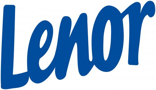
The original logo featured the word “Lenor” in a rather bold type. The letters were interconnected like in handwriting.
2003
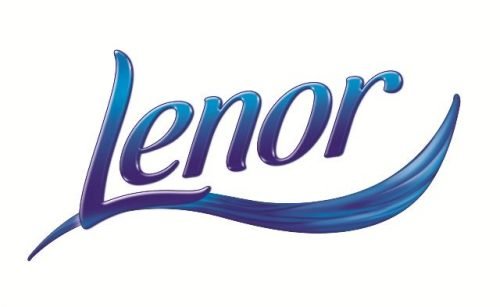
The type grew thinner and slightly changed its shape, although it still looked as casual and relaxed as its predecessor. The lines of the “L” were replaced by waves, to create a link with the water.
2016
The “wave” on the “L” grew less prominent. The direction of the line grew lower. A “whirl” emblem was added.
Font and Color
The bold and elegant lettering from the primary logo of Lenor is set in the title case of a smooth sophisticated cursive font with sharpened ends of the bars. The closest typefaces to the one, used in this insignia, are, probably, Fonia Italic, or Aligarh Medium Italic, with some significant modifications of the contours.
As for the color palette of the Lenor visual identity, it is based on a deep and bright shade of blue, with white accents, which represents freshness and cleanliness, reflecting the purpose of the brand’s products.


