LendingTree is one of the most famous financial marketplaces in the USA. The company was established in 1996 and became the largest in its segment. LendingTree offers a wide range of loans and insurance deals to choose from.
Meaning and history
LendingTree pretty young company, which was founded in the middle of the 1990s with the revolutionary for those times idea of creating an online platform, where everyone could buy interesting financial products, suitable for their needs.
Today, LendingTree is a circular international loan and mortgage company that originates, reviews, approves, and finances residential real estate mortgages, as well as offers mortgage repayment services. The company is also a broker and offers its many customers a variety of financial products that can be purchased online.
What is LendingTree?
LendingTree is the name of a popular and reputable financial marketplace, which was established in the United States in 1996. The online platform was created by Doug Lebda, which is still the company’s CEO today. Today it is the most popular destination for purchasing financial products.
1998 – 2009

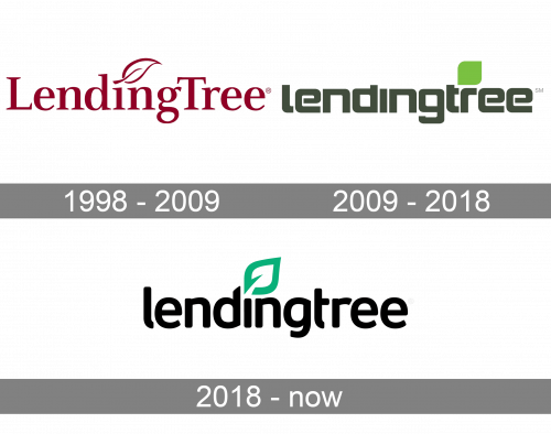
The oldest logo in the list already has the recognizable core we can see in the current LendingTree logo – the name of the brand paired with a leaf above.
Here, both the elements share the same brownish-red color, the color of the dry blood. The type is rather generic and has a certain traditional elegance due to its serifs and the varying thickness of the strokes.
2009 – 2018
The brownish-red was replaced by dark gray (for the wordmark) and green (for the leaf). While in the previous logo, the leaf was supposed to replace the dot above the “i,” it was now moved to another place and stood above the “r.”
However, in the current version, the leaf again took up its old place.
2018 – Today
The LendingTree visual identity is stylish and minimalist. The logo was redesigned in 2018 by an In-house agency and is based on the brand’s previous version. It is composed of a wordmark with an elegant graphical element above it.
The LendingTree inscription in all the lowercase lettering is executed in a bold modern sans-serif typeface with thick rounded lines. “L” and “T” have their tails shortened, which gives a more fashionable and contemporary look to the whole logo.
The dot above the letter “I” is replaced by a green leaf, which features only a bold contour and is inclined to the right. It is a symbol of life and energy, and its direction shows the company’s target on the future and its progressive approach.
The color palette of the LendingTree logo is based on three main colors — navy blue, green and white. The colors can be switched depending on where the logo is being placed.
Font and color
The bold lowercase lettering from the primary badge of LendingTree is set in a softened modern sans-serif typeface with thick lines and rounded ends of the edges. The closest fonts to the one, used in this insignia, are probably, Dynasty Bold, or New June Bold, but with some slight modifications of contours.
As for the color palette of the LendingTree visual identity, it is set in black and green, a bright and confident combination, which evokes a sense of professionalism and growth. Green is known to be a symbol of wealth and prosperity, which makes sense considering the specialization of the company, plus it emphasized the “Tree” part of the company’s name, which is used for the leaf, replacing the dot above the “I”.


