Lays is an iconic brand of snack from the USA, which was established in 1932. Today it is one of the most famous label of chips, with distribution and production facilities across the globe.
Meaning and history
The company was named after its founder, Herman Lay, who renamed the acquired in 1938 “Barrett Food Company” into “HW Lay Lingo &Co”.
What is Lays?
Lay’s is an American brand of snacks, which was established in 1940, and today is one of the world’s most famous manufacturers of chips. Lay’s portfolio counts dozens of flavors, with its product distributed in supermarkets all over the globe. The brand is a part of the Frito-Lay company.
1932 – 1965
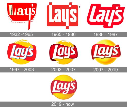
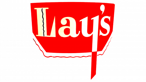
The first Lay’s logo was created in 1932 and is still a base of today’s visual identity design of the renowned brand.
The logo was composed of a red horizontal rectangular with rounded angles and white bold lettering on it.
1965 – 1986
The logo created for Lays in 1965 was cool and modern. It still consisted of a white lettering on a red background, but this time the shape of the red banner was stricter — a rectangle with rounded corners. And the inscription was executed in an ExtraBold sans-serif, with the tails of the lowercase letters coming out of the rectangle and changing their color from white to red.
1986 – 1997
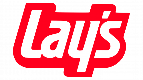
In 1986 the logo is redesigned, but the color palette remains untouched. The wordmark is now italicized, which thicker and more confident lines of the letters.
As for the red rectangular — it is gone, now the background repeats the shape of the nameplate. The logo looks bright and eye-catching due to the red-white color combination, which is a reflection of warmth, passion, and energy.
1997 – 2003
In 1997 logo gets an additional color — yellow. It is used for a circle of the background, which is drawn uneven and looks dynamic. The lettering is refined in more traditional lines and got a blue shadow.
The red background is now replaced by the red ribbon, drawn around the yellow sun. It is the first version of the logo we all know today.
2003 – 2007
In 2003 the lettering and the shape of the logo are slightly modified. The blue shadow is replaced by a dark red, which looks more elegant and confident. The lines of the emblem are cleaner and stronger now.
2007 – 2019
In 2007 the logo gains a three-dimensional form, keeping the iconic color and shape composition. It looks bright, remarkable and solid. The lettering is bold and boasts a strong and sophisticated typeface, while the shape of the emblem is now perfectly balanced.
2019 – Today
The redesign of 2019 made the Lay’s logo flat again. The badge, executed in intense yellow and red, with the white lettering on a banner, surrounding the yellow circle, still has some gradient shades, but they add more movement and dynamics than volume to the image. The lettering was refined and made more compact, which gave a balanced and professional look to the emblem of the iconic badge.
Font and color
The Lay’s white logotype from the logo, introduced in 2019, is written in a custom smooth typeface with elegant lines yet thick and confident lines. The type, which was exclusively created for the brand, is close to such fonts as Makozin Heavy Italic and Bluestar Medium Italic but with some lines modified.
The yellow and red color palette of the Lays logo is a representation of energy, power, and passion, and in combination with white, it evokes a sense of professionalism and reliability of the brand, which is concentrating on the quality and flavor of its product.


