Lane Bryant is an American fashion brand, specialized in plus-size women clothing. The company was established in 1902 and today distributes its products across the globe mainly through its online store.
Meaning and history
The American label Lane Bryant is famous for producing clothing in large sizes. The brand is part of Charming Shoppes Inc, a company that also owns other clothing and accessory brands.
The company was founded in the early 20th century by Lena Himmelstein, an immigrant from Lithuania, who opened the first maternity store in the United States and then introduced the concept of plus-size fashion to the world.
Today Lane Bryant is one of the most famous brands in this segment, which operates mainly via its online platform, and hence can deliver its products to any corner of the globe. Apart from lingerie and closing, Lane Bryant also designs accessories and creates perfumes.
What is Lane Bryant?
Lane Bryant is the name of an American fashion brand, which is specialized in the production of clothing for plus-size women, along with accessories and perfumes. The company was established in 1904 by a Lithuanian immigrant, Lena Himmelstein.
1969

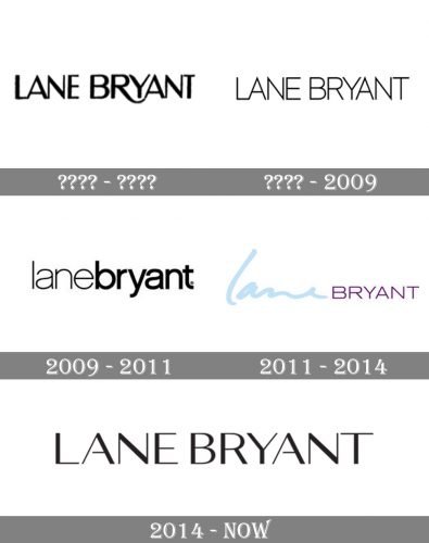
The Lane Bryant logo has always been a typographical one, which means it hasn’t included pictorial elements. And yet, it has a recognizable visual identity as for most of its history the company has stuck to the typeface of a pretty similar style. There have been only a couple of exceptions.
For instance, if you compare the old version showcased above with the current logo, you’ll notice how similar they look. The older version is slightly heavier and has an “R” with an extended end, though.
Before 2009

The wordmark grew cleaner. The effect resulted from the lighter type and the disappearance of the long end on the “R.” Also, the strokes forming the letters now had the same thickness.
2009 – 2011
For two years, the company used a very different design, with lowercase letters. Here, there was no space between the two words – the border between them was created by the combination of light and bold typefaces.
2011 – 2014
Once again, the company tried to experiment with its visual brand identity. On the one hand, the designers returned the recognizable old typeface (it was used for the word “Bryant”). This helped to reflect the brand’s heritage in the logo. On the other hand, the authors of the logo added an original nuance by coloring the wordmark. Also, they gave the first word in a unique cursive script. Supposedly, this added personal touch.
And yet, eventually, the brand returned to its original style.
2014 – Today
The Lane Bryant visual identity is based on the classic fashion industry principles — minimalism, monochrome, elegance. The logo is composed of a wordmark in all capital letters.
The typeface is sans-serif with straight lines and sharp angles. The pointed tops on two letters “N” make the whole nameplate look strong and unique.
Usually written in black and placed on a white background, the logo sometimes switches its palette and puts white lettering in a black rectangle. That makes it look brighter and more modern.
The brand’s signifier, which is also used as a website icon, is composed of two capital letters, “LB”, which are connected to each other, yet there is a small vertical white line on the bottom of the letter “B”, showing where the elongated tail of “L” ends.
The Lane Bryant logo is minimalist yet powerful. It shows the brand’s individuality and creative approach, as well as huge attention to details.
Font and Color
The uppercase elegant lettering from the primary logo of Lane Bryant is set in a custom fancy sans-serif font with some interesting details in the contours of the capital leets. The closest fonts to the one, used in this insignia, are, probably, Ainslie Contrast Extended Demi, or Cabrito Contrast And Ext Demi, but with the contours of some letters modified and the horizontal bar of the “A” shortened, letting air inside the character.
As for the color palette of Lane Bryant’s visual identity, there is nothing new, as the brand uses a combination of black and white, the timeless option, which makes the company look modern and stylish, representing its professional qualities, stability, and expertise.


