Lakme is the most famous and lived cosmetics brand in India, which was established in 1952 by Tata Group. Today it is one of the Unilever labels, specialized in the production of make-up and skincare products, which is distributed all over India, Nepal, and Indonesia through its branded stores and salons.
Meaning and history
The brand got its name from the French version of the goddess of beauty, Lakshmi, name. And this French mood and style have always been with the brand, adding modesty and elegance to the company’s laconic logos, brightening its make-up products palettes, and, of course, elevating the quality of the cosmetics.
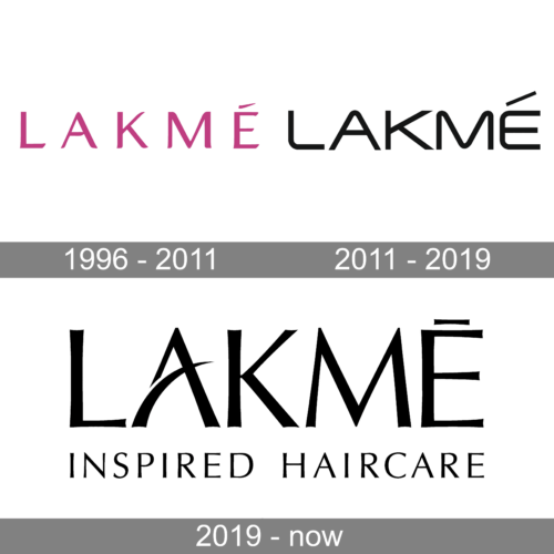
For the first decades of the brand’s history, its logo was composed of a simple mani chrome lettering with nothing special in it. The inscription could change its color depending on the background of the cosmetics packaging and was more “an addition”, than the “face” of the brand. The first logo with personality was created for the brand in 1996.
1996 – 2011
 The Lakme logo, introduced in 1996, featured a dark pink logotype executed in the uppercase of a stylish and smooth sans-serif typeface. The letters featured their clean straight lines’ tails rounded from one side and pointed from the other, which added playfulness to the emblem, showing the brand’s purpose and unique style.
The smooth lines also elevated the Eastern roots of the brand and the Asian understanding of beauty.
As for the color, deep pink, close to purple, shade was meant to celebrate femininity and passion. The color also stands for love, warmth, and, of course, beauty, which the brand aims to give to each and every one of its customers.
2011 – 2019
2019 – Today
 The redesign of 2011 changed the typeface and color palette of the Lakme visual identity, elevating the emblem’s look and making it modest and strong. The new logotype for its letters extended and more solid, while the monochrome color palette made the inscription look professional and evokes a sense of expertise and authority.
There was also an emblem, created for the brand in the same year. It is usually used on its own but sometimes is placed near the logotype. The solid fuchsia circle with a white “L” on it. The letter resembles the typeface of the official version, yet had its angles softer, and lines — longer.
Font and color
The modern and stylish Lakme logotype in all capitals is executed in a custom sans-serif typeface c which is pretty similar to such fonts as Winner Sans Extended Regular and Distancia Regular, but with the contour of the letters smoothened and some lines modified.
The monochrome color palette of the official emblem is an understandable choice for a cosmetic brand, as it looks strong and bright on any background and in any surroundings. As for the pink and white color scheme of the Lakme emblem, it is a reflection of the brand’s purpose, and its value of its customers’ beauty and happiness.


