Lady Gaga is a stage name of the iconic American singer, Stefanie Joanne Angelina Germanotta, born in New York in 1986. Lady Gaga became popular at the beginning of the 2000s and has released six albums by today, selling more than 130 million copies worldwide.
Meaning and history
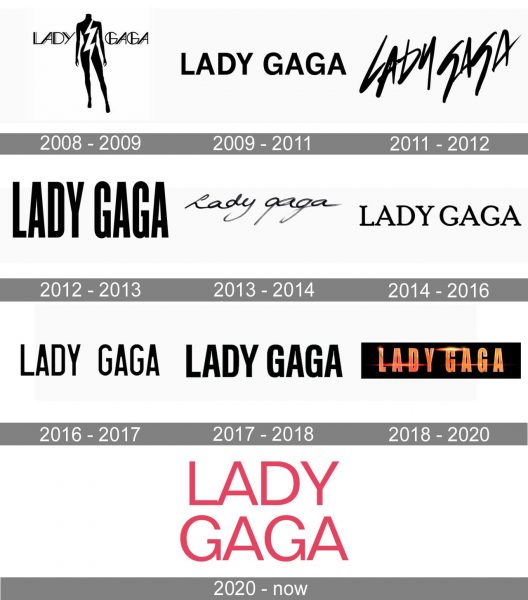
One of the most stylish and mysterious pop-stars in the world, Lady Gaga likes changes and her visual identity is being redesigned pretty often. Though each of the versions always reflects one of the Lady Gaga’s unique traits, all the logotypes created throughout the singer’s career, look completely different.
2008 — 2009
The initial logo, created in 2008, is different from all the others because it was the only insignia where the wordmark was accompanied by the graphical image. To be precise, it was the image in the center of the logo, its main hero.
The black woman’s silhouette without clothing and without the head had a bold white lightning bolt placed along its body. The nameplate was placed from both sides of the picture, featuring a modern sans-serif typeface with straight lines and cuts.
In the same year two more logos were created — one in monochrome, written in a thin classy serif font with a vertical line separating “Lady” from “Gaga”, and another one — candy-pink cursive lettering with a fuchsia outline.
2009 — 2011
Since 2009 and until 2011 Lady Gaga uses a minimalist and modest logotype in a traditional and simple sans-serif typeface, with clean contours and distinct lines.
2011 — 2012
In 2011 there were three different versions designed — the black handwritten nameplate, which was created for the “Born This Way” cover, the pink bold sans-serif “Gaga” in all-caps, and its simplified version in black, with “Lady” added.
2012 — 2013
Two more logotypes were created in 2012. One of them was a stylish monochrome sans-serif inscription with narrowed and elongated letters, while the second featured a three-dimensional gold lettering in a serif typeface, placed on a black background.
2013 — 2014
2013 was the most colorful and intensive in terms of design year. Two black handwritten logotypes were accompanied by a super bold and bright fuchsia nameplate, where the condensed letters in sans-serif had a pattern of broken glass.
2014 — 2016
Lady Gaga goes old style in 2014. A vintage-inspired book-style serif typeface for her new monochrome logotype looks classy and makes the logo recognizable and memorable despite its simplicity and modesty.
2016 — 2017
For the new album, “Joanne”, Lady Gaga chooses a solid geometric sans-serif inscription in black. All the letters look strong and even brutal, yet they are so perfectly balanced in terms of spaces and lengths, that there is a sense of elegance and sophistication in every millimeter of the new logo.
2017 — 2018
The logo is being simplified in 2017. The sans-serif typeface from 2011-2012 comes back with thinner lines. The main color scheme is still black and white, which is powerful and timeless.
2018 — 2020
In 2018 another logo was designed. The three-dimensional orange lettering in the recognizable sans-serif is placed inside in a black background, complemented by red and orange flashlights, reflecting passion, energy, and futuristic character.
2020 — Today
For the new “Chromatica” album the logo was redesigned in 2020. The light pink and white color palette looks fresh and bright, while the traditional contours and clean lines of a modern sans-serif typeface add professionalism and simplicity to the composition. The typeface of the logo, introduced by Lady Gaga in 2020, is very close to Naville Regular and Geométrica Book fonts, with the letters “L” and “A” touching each other or their bottom points.


