Kroger is one of the most popular American supermarket chains, It was established at the end of the 19th century and named after its founder, Bernard Kroger. Despite the declining popularity of the supermarket format, Kroger manages to stay afloat and confidently hold second place in the ranking of the largest U.S. retailers.
Meaning and history
The Kroger supermarket chain was founded back in 1883 when Bernard Kroger, the fifth child in a family of German immigrants, opened his first grocery store in Cincinnati under the Great Western Tea Company name.
Two years later he opened 3 new stores, in 1893 he increased the number of stores to 17, and in 1902 the chain already had 40 outlets. In the same year, Bernard renamed the retail chain to The Kroger Grocery and Baking Company. As the new name implies, Kroger was the first American retailer to bake its bread for its stores.
In 1904, after the purchase of Nagel Meat Markets and Packing House, Kroger stores introduced meat departments for the first time. In a way, Kroger can be called the progenitor of modern retail formats, because in 1916 the company opened the first self-service stores on the market. In addition, from the very beginning of its journey, Kroger has always combined trade with production.
Kroger bought up farms and factories where it grew and produced its own products. Kroger’s employees sent all the customers who doubted the quality of the products to the farms owned by the company so that they could personally verify the naturalness of their products. Kroger soon began expanding beyond Cincinnati and opening stores in other cities and states, absorbing local players.
In 1930, the Kroger Food Foundation was founded, the first company in the United States to conduct scientific testing to control food quality. At the same time, Kroger established the Housewives’ Reference Committee, a group of 750 women from all over the country who personally tested the company’s products. All of these measures increased Americans’ trust in Kroger and chain stores in general.
That same year, company manager Michael Cullen suggested to his superiors to open a larger self-service store and sell a large number of products at low prices that could not be beaten by competitors. Kroger realized the revolutionary nature of the new format, and by 1935 there were already 50 such supermarket stores operating under the Kroger sign. Supermarkets became most popular among Americans in the 1960s and 1980s. Then Kroger began to gradually abandon its traditional small stores in favor of supermarkets.
Today Kroger is on the top of the list of American supermarket chains, with more than two thousand stores all over the country.
What is Kroger?
Kroger is the name of the largest grocery supermarket chain in the United States, which was established in 1883 by Bernard Kroger. Today, Kroger operates nearly 2,726 stores in 35 states – primarily in the Midwest and Southern United States. The average supermarket, of which there are 2,284, has an average floor area of 15,000 square meters.
1883 – 1902
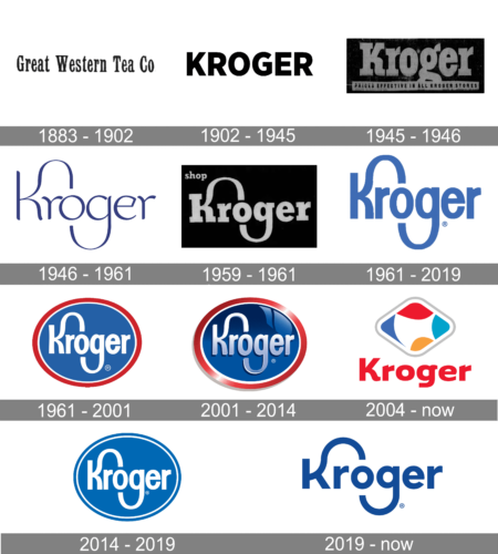
The very first Kroger logo was introduced in 1883 and stayed with the company for almost two decades. The logo was composed of a simple traditional inscription in black elegant serif letters set on a white background. The “Great Western Tea Co” logotype was a bit narrowed but still looked solid and confident due to the thickness of the lines and visible serifs.
1902 – 1945
Starting in 1902 the company begins to use a strong black logotype as its official badge. The black uppercase “Kroger” inscription was usually set on a white background and executed in a clean strict sans-serif typeface with neat contours of its massive letters with distinct cuts of the lines’ ends.
1945 – 1946
The redesign of 1945 has created a bold and stable banner for the brand, with the heavy title case lettering set in an elegant serif font with thick lines and massive yet sophisticated serifs. The inscription was set in gray against a black banner, and was underlined by a thin horizontally-stretched banner in gray, with a black uppercase inscription on it.
1946 – 1961
The redesign of 1946 brought Kroger the image, which became a basis for the iconic logo we all can see today. It was an elegant white inscription in a custom typeface set on a calm blue rectangular badge. The main thing I of the new logo was the letter “K” with its upper bar elongated and curved, arching to the middle point of the letter “O”, and covering the lowercase “R”. It was a unique and recognizable badge, which evoked a sense of high quality and reliability.
1959 – 1961
In 1959 the stylized lettering got emboldened, and rewritten in a heavy serif font with the elongated and arched bars of two characters, repeating the concept of the previous version. The new badge was set in a gray and black color palette, with some additional lettering in small lowercase sans-serif characters.
1961 – 2019
In 1961 the company has introduced another version of its recognizable wordmark, which stayed with the brand for more than half a century. It was a bold sans-serif lettering in a smooth shade of blue, written against a plain white background. The concept with the arched smiling bars was modernized and refined, making up a very powerful and stylish look of the badge.
1961 – 2001
 The 1961 redesign resulted in a logo that looked almost the same as the current one. The wordmark in an updated typeface was positioned inside a red ellipse frame.
2001 – 2014
The logo, created for the company in 1961, was refined and modernized in 2001. The composition remained untouched, but gloss and gradient colors were added to the badge to make it three-dimensional. The new Kroger medallion looked sleek and fresh, showing the growth of the company and its ability to change without forgetting its roots and following traditions.
2004 – Today
One that stands out is Kroger. The Red lettered logo with the rhomboid above the word Kroger. The white space inside the four colors is a modern conceptual rendering of the continental United States, with Washington, Maine, Florida, and Texas states at the points.
2014 – 2019
The redesign of 2014 has brought back the blue roundel from the 1960s, but simplified its color palette to just two shades, replacing the bold red outline with a thinner blue one. Another change was made to the shade of blue, used for this insignia — it got softer and lighter.
2019 – Today
In 2019 the company decides to come back to its iconic logo, but refined it and makes it more modern. The lettering with the arched line of the first “K” today is executed in blue and set on a white background. All shapes are slightly extended and made more confident and solid. The custom font featured bold lines and strict cuts.
Font
Although the typeface has been altered throughout the company’s history, it has stayed remarkably consistent in the distinctive curves on the letters “K” and “g” – even the 1939 version of the Kroger logo already had them.
Color
The standard logo is incredibly minimalistic in terms of color: it features only white and blue. However, we can’t but mention the 2006 version combining white, dark blue, red, green, and yellow.
What is the meaning of the Kroger logo?
The Kroger logo, introduced in 2019, is a very stylish and progressive wordmark with an elongated arched line, making up a smiling face. These abstract elements stand for the friendliness of the brand and its gratitude to its customers. Also, the Kroger badge is a graphical representation of the company’s edgy and progressive approach to business.
What is the Kroger brand?
Kroger is the name of an American company, which owns a chain of supermarkets all over the country. The stores under the Kroger brand sell all types of food products, including meat, fish, fresh fruit, and vegetable, along with frozen foods and condiments.
What is the Kroger logo supposed to be?
The Kroger badge, created in 2019, is based on the company’s badge, introduced at the end of the 1930s, and being an essential part of the retailer’s identity for decades. This is a wordmark with two lines elongated and arched. One of these lines is the tail of the letter “G”, which finishes under the “O”, making up a smiling face in googles.
Did Kroger change their logo?
Kroger is a company with a long history, and its visual identity was changed several times throughout the years. The very first badge was created for the brand in 1883, and redesigned in 1902, with the new version introduced in 1939. The company has three more refinements of its badge held before 2019 when the current Kroger logo has come out.


