Like the majority of department store retailing chains, Kohl’s Corporation has always had a simple wordmark-based logo.
Meaning and history
The American retailer was originally a grocery store. Opened by an immigrant from Poland, Maxwell Kohl by name, the store appeared in one of the Milwaukee streets (Wisconsin) as early as in 1927. The first department store opened 35 years later. That day in September 1962 is considered to be the day when the company was born.
As the business was not yet established at that time, they added the wordmark “Department Stores” below the company’s name so that customers could learn what exactly the company dealt with. The wordmark was of a small size, though, while the word “Kohl’s” was several times larger.
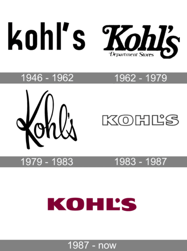
1946 – 1962
The original Kohl’s logo was introduced in 1946 and stayed with the depart stores chain for more than a decade. It was a simple yet powerful black and white badge with the custom lowercase wordmark in bold black letters with contours slightly narrowed set on a plain white background. There was nothing special or additional on the insignia, but the arched elements of the letters made the inscription unique and instantly recognizable.
1962 – 1979
 The first Kohl’s logo was introduced at the same time as the department store opened. It was a wordmark-based logo consisting of the company’s name “Kohl’s” and the “Department Stores” in a slightly inclined serif font.
1979 – 1983
The customers saw the second version of the Kohl’s emblem in 1979. It did not feature any new elements, but the typeface changed. The wordmark “Kohl’s” appears to have been drawn by hand, while the “Department Stores” written in uppercase sans serif acquired a more modern look.
1983 – 1987
1985 – Today
The 1985 symbol, like the previous ones, is a wordmark logo. Yet, it has changed. As the consumer awareness of the brand had increased by that time, the retailer got rid of the lettering “Department Stores”. Now the corporate symbol includes only the company’s name, which makes it easy to use it in marketing material and branding.
The serious and legible extra-bold Helvetica feels secure. Combined with the strong typography the emblem ensures strong brand recognition.
The Kohl’s logo palette consists of one color ‒ Burgundy (#800033).


