The leading carrier airline of the Netherlands, KLM Royal Dutch Airlines is the oldest airline in the world still operating under its original name.
Meaning and history
The Dutch airline KLM was founded by military pilot Albert Pleasman in 1919, and a few months later the airline was granted the “Royal” status by royal decree. The acronym KLM translates from Dutch as the “Royal Airline Company”. The company logo is a stylized crown.
In 2004 there was a merger with Air France, which in turn led to the creation of one organization called Air France-KLM. But strangely enough, with common management, both divisions are as independent as possible, have maintained autonomy and still both fly under their own brand.
Today this group is Europe’s largest association of air carriers, whose main areas of activity are passenger and cargo air transportation, as well as aircraft maintenance. The airlines’ customers have access to a route network covering 316 destinations in 115 countries.
Air France and KLM are part of the SkyTeam alliance of 20 airlines, which offers customers an extensive route network with more than 16,320 daily departures to 1,052 destinations in 177 countries.
What is KLM?
KLM is the name of a Dutch airline, part of the Air France-KLM holding. It operates domestic and international flights. The company was established in 1919, and merged with Air France in 2004. KLM is the oldest air carrier in the world, which still uses its original name.
1919 – 1921
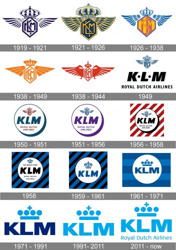
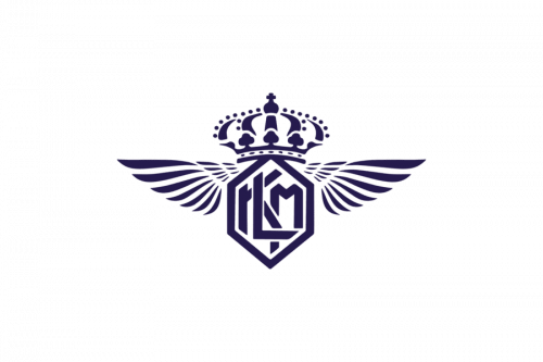
KLM Royal Dutch Airlines received its first badge in the year of its establishment, 1919. It consisted of the intertwined K, L, and M characters, placed in a hexagon shape and accompanied by wings and a crown.
1921 – 1926
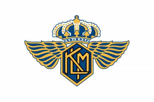
In 1921 the logo got its color palette switched to calm medium-dark blue and yellow, where all the elements were kept in their places, yet started looking more precise and confident, in the new shades and with a strict black outline. The winds and the crown around the crest got enlarged and redrawn in a smoother and more sophisticated manner.
1926 – 1938
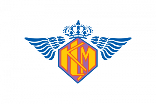
The redesign of 1926 changed the colors and style of the main part of the KLM logo, drawing the thick large geometric letters in yellow, outlining them in red, and placing them on a light pink background. This new delightful badge boasted a small and sophisticated crown and two delicate wings. All three elements were drawn in blue and white.
1938 – 1949
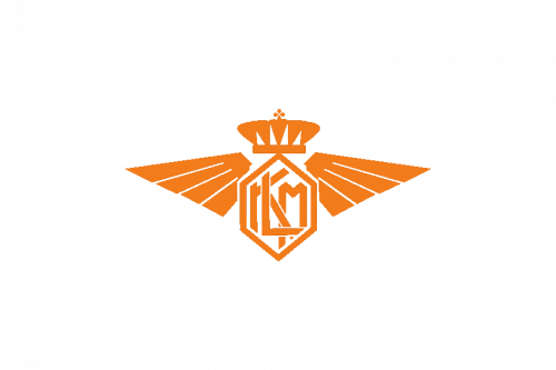
The logo was simplified in 1938. The multicolor palette of the previous version was switched to orange and white and the contours of the badge returned to the one from the original version, though the lines of the additional elements were now drawn in a more modern and simple way.
1938 – 1944
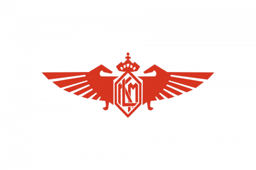
Another version created for KLM in 1938 was executed in dark red and placed on a white background, with the wings stylized and looking line two abstract horses with their heads turned to the crest. It was a cool contemporary badge, which made the company stand out in the list of its competitors.
1949
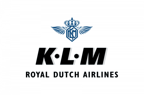
The badge switched its color palette to blue and white again in 1949 and got additional lettering in black bold capitals under it. The “KLM” inscription had two solid black dots separating the letters from each other, and they’re also was a “Royal Dutch Airlines” tagline, executed in a narrowed italicized sans-serif.
1950 – 1951
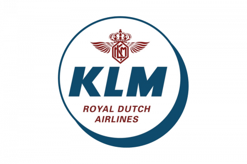
In 1959 the emblem and the tagline got colored in burgundy, while the KLM logotype became the main part of the badge and was drawn in blue and set in the middle of the new circular insignia, outlined in the same shade of blue.
1951 – 1956
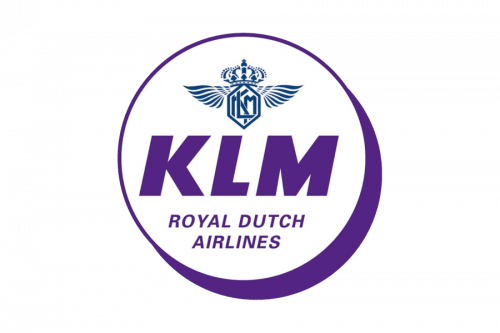
Everything but the winded emblem on the KLM logo changed its color to purple. As for the iconic crest, it was now again drawn in blue and set on a white background. The composition and shape of the emblem remained the same as on the previous version of the logo.
1956 – 1958
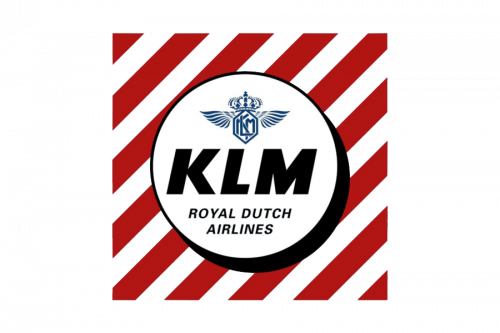
All purple elements were replaced by black ones and the circular emblem got placed on a fancy and bright square with a red and white diagonally striped pattern. The KLM visual identity looked bright and strong, showing the company as a progressive and innovative one.
1958
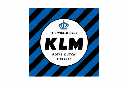
The red and white stripes were changed to blue and black ones in 1958. This was also the year of big change with the emblem — the iconic winged crest was replaced by a smooth blue crown with the “The World Over” tagline in the same sans-serif typeface as the “Royal Dutch Airlines” inscription.
1959 – 1961
All additional lettering was removed from the logo in 1959, and now the white circle on a diagonally striped blue and black background boasted a bold sans-serif KLM inscription in calm blue with the smooth elegant crown above it. The crown was drawn in the same color as the wordmark.
1961 – 1971
The diagonal stripes were changed to horizontal ones, and the black color was replaced by a lighter shade of blue in 1961. The central elements of the logo were also changed and now the inscription featured a modern geometric sans-serif typeface with extended contours and straight angles and cuts of the letters, while the vein also got horizontally stretched and was now composed of a thin rectangle with four solid dots and a cross above it.
1971 – 1991
In 1971 the KLM logo was simplified and all the elements except for the central two were removed. Now the KLM inscription is drawn in a dark and bright shade of blue and the stylized crown with the cross uses a light blue shade, resembling sky and flights.
1991 – 2011
The redesign of 1991 was all about the color palette of the KLM visual identity. Thus, the lettering and the crown started using the same shade of blue — light and crispy. This made the whole image look more progressive and even young.
2011 – Today
The current version of the KLM logo was adopted in 2011. Its most important elements remained the same – the wordmark and the crown – but their looks changed. A clear, legible sans-serif font is used for the lettering, while the crown looks more stylized. There is also the “Royal Dutch Airlines” inscription below the emblem.
Font and Color
The very stable and brutal lettering from the primary badge of the KLM airlines is set in the uppercase of an extra bold geometric sans-serif font, which looks pretty similar to such typefaces as Benzin Extra Bold, or Swiss 721 Std Black Extended, but with the modified contour of the “K”.
As for the color palette of the KLM visual identity, it is based on just one shade — a light and pleasant blue, which represents reliability and safety, at the same time being associated with the sky, flight, and freedom.


