KinderCare is the name of the chain of learning centers, which was established in 1969 in the United States. Today the educational company, founded in Alabama, operates all over the country, having more than 1,5 thousand locations and almost 40 thousand employees.
Meaning and history
KinderCare is an American company, which is engaged in educational activities for kids from 6 to 12 years old. The organization had more than 1,5 thousand centers all over the country, with the main one in Oregon. Today the company provides its services to over 200 thousand children in 39 states of the USA.
Almost half of all KinderCare centers have accreditation by the National Association for the Education of Young Children. In 2015 the chain of KinderCare educational centers was acquired by a Swiss company Partners Group.
What is KinderCare?
KinderCare is a chain of children’s education centers, which was established in the USA in 1969, and today successfully operates all over the country, having more than 1,5 thousand locations. The organization is specialized ineducation programs for kids from 6 to 12 yo.
Before 2021

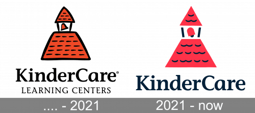
The original logo was in many ways like its successor. Unlike it, the illustrations here are less geometric, look more hand-drawn and use orange colors with bold black outlining. In addition, this version has ‘learning centers’ written below the main wordmark.
2021 – Today
The KinderCare logo is stylish and modern, though there is something nostalgic and tender in it, probably it is a typeface that evokes this feeling. Executed in a traditional red and black color palette the emblem does not look aggressive or dark, on the contrary, it seems to be warm and caring.
The KinderCare logo is composed of a red and white emblem with a black outline and black lettering on the right, with a delicate lightweight tagline in capital letters. The “Learning Centers” tagline is placed under the main wordmark, which is executed in a bold sophisticated serif typeface. The most similar font to the one used for the KinderCare logo is ITC Stone Informal Pro SemiBold with smooth rounded elements of the letters “R” and distinct serifs.
The emblem is the brightest part of the visual identity and it boasts an image of the house with the red tile roof, a symbol of warmth and coziness. This image shows the value of love and friendship and points on a special attitude to kids all the employees of the company have.
The simplicity of the color palette and a pretty minimalist concept of the logo do not make it boring or modest. The KinderCare insignia has everything necessary to reflect its purpose, mood and main aim — give only the best to the kids.
Font and color
The smooth and elegant title case inscription from the primary badge of KinderCare is set in a bold serif typeface, which is very close to such fonts as ITC Stone Informal Pro Semi Bold or Passenger Serif Semibold. The lettering looks very confident, although also has something very kind and tender in the contours of its characters.
As for the color palette of the KinderCare visual identity, it is based on the combination of red, black, and white, with red as a symbol of love and caress, and black-and-white details adding a sense of professionalism and reliability.


