Simple as it is, the Kik logo has everything what makes a modern and distinctive logotype creating a strong brand identity.
Meaning and History
Kik is the short name used for one of the most popular instant messaging mobile app Kik Messendger. The application was created by several students from the University of Waterloo in Canada.
2010 – 2017
The 2010 Kik logo was their own brand’s name written in pale green. The style letters used was soft, round and very simple. Apart from them, there was also a little blue-colored circle floating to the right of the last letter ‘k’.
2017 – Today
They changed the coloring by 2017. Namely, everything in the logo switched to a brighter green hue.
Symbol
The logo features the lettering “kik” in plump lowercase letters with rounded ends. The lime green color creates vivid, bright, and fresh mood. The dot placed to the right looks seems to invite the user to press the favicon.
Emblem
The overall impression of the logo is friendly, simple, and modern. That’s why it is only natural that it hasn’t changed that much since its introduction, except for a slight shift in the colors.
Font
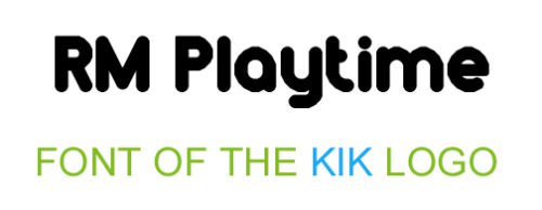
The typeface looks somewhat similar to the RM Playtime Solid font with its rounded letters. However, if you take a closer look, you may notice that the bars of the “k” on the Kik logo are placed a bit higher than in the RM Playtime Solid font. Also, the original version of the font contains the “i” with a round dot, while the same letter on the logo is given without the dot. The height of the “i” as compared to the “k” is different, as well as the distance between the letters.
In the Chevin ExtraBold font, which also resembles that of the Kik wordmark, the proportions and the angles between the bars making the “k” are slightly different.
So, although the letters of the Kik logotype seem very much like those of a couple of other fonts, they were heavily customized, at least. More likely, thought, that the logo was actually drawn by hand.
Color
The shade of green used on the current logotype is close to the one that goes under the index #82bc23 in the hex system. The older emblem also featured a light blue dot (hex: #3db4e7). Also, the older versions of the logo featured a black or dark grey background with a metallic feel.


