

![]() KeyBank Logo PNG
KeyBank Logo PNG
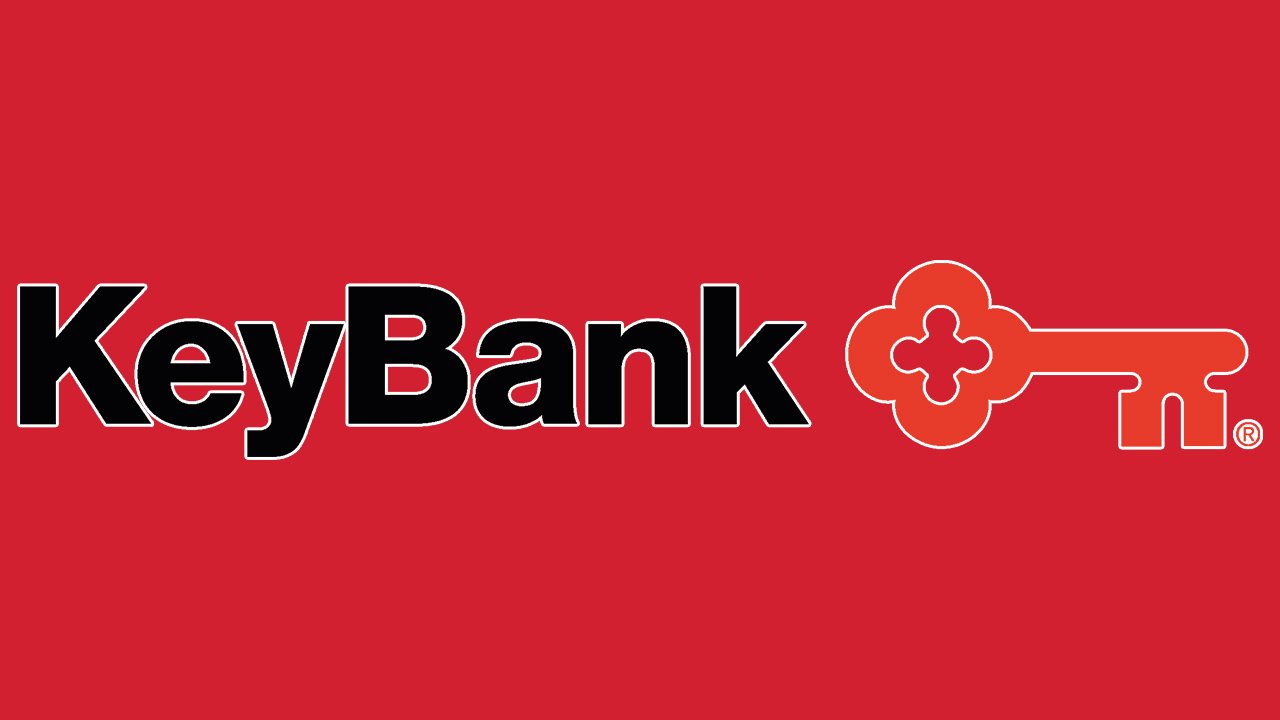
Eye-catching and unique, the logo of KeyBank is the most important part of the company’s visual identity.
Meaning and history
![]()
KeyBank is a regional bank headquartered in Cleveland, Ohio, United States. It is the main subsidiary of KeyCorp. The parent company appeared over 25 years ago as a result of a merger of Society Corporation of Cleveland and KeyCorp.
The bank has a rather long history, which can be traced as far back as to 1849 (when Cleveland’s Society for Savings was established) or even 1825 (when Commercial Bank of Albany, New York, was established).
Symbol

The KeyBank logo can be broken down into two parts: the wordmark (in black) and a stylized key (in red). The two elements can be positioned next to each other (“KeyBank” to the left, the key to the right) or one above the other. In the latter case, the key is typically placed in the right corner but you can also come across versions where it is in the left corner.
While the typeface is pretty generic, the key makes the design unique. It is large and has a recognizable shape. Interestingly, the “head” of the key also reminds a keyhole or a flower. When a company needs to use a compact icon (for instance, on the website), it opts for the key without the lettering.
Old emblems

The brand identity of the bank has been rather consistent over the last decades. You can come across versions with taglines, including “Use the red key” and “Achieve anything.”
Font
The design forces behind the KeyBank logo have opted for a pure and perfectly legible sans with classic proportions. On the one hand, it does not look very unique, while on the other, this type does its job perfectly.
Colors
![]()
The palette combines black and white with the rather eye-catching shade of red. The color is reminiscent of the color of the blood. It looks like the shade known as Boston University Red (Hex: #CC0000, RGB: 204, 0, 0).


