Kashi is a brand known for its natural and organic foods, specializing in products like cereals, snacks, and frozen items. Founded in San Diego, California, by Philip and Gayle Tauber, Kashi was created with a vision to provide wholesome, health-focused food options. Their products often feature a mix of whole grains, nuts, and seeds, catering to health-conscious consumers seeking nutritious and environmentally sustainable food choices. Kashi emphasizes natural ingredients, minimal processing, and sustainability in its offerings.
Meaning and history
Kashi, an innovator in natural foods, was born in 1984 in San Diego, California, thanks to the entrepreneurial spirit of Philip and Gayle Tauber. The Taubers, passionate about nutrition and well-being, embarked on a mission to create nourishing, plant-based foods. They named the company ‘Kashi’ to reflect their commitment to natural, whole foods, drawing inspiration from ‘Kashruth,’ meaning kosher or pure food.
The company’s journey began with a single product, Kashi Pilaf, a mix of grains and seeds, which set the tone for their future offerings. As Kashi expanded, it introduced a range of cereals, snacks, and frozen foods, all aligned with their ethos of wholesome, minimally processed ingredients. Their products, often featuring a unique blend of seven whole grains, resonated with health-conscious consumers.
In the 1990s, Kashi’s growth skyrocketed as the demand for healthy, convenient foods surged. Recognizing Kashi’s potential, Kellogg’s acquired it in 2000, broadening its reach. Despite this, Kashi maintained its identity, continuing to innovate with organic and Non-GMO products.
Kashi’s evolution reflects a blend of entrepreneurial zeal and a consistent focus on health and sustainability, making it a respected name in the natural foods sector.
What is Kashi?
Kashi is a trailblazing brand in the natural food market, renowned for its wholesome and organic products. Founded with a vision of nourishing well-being, Kashi offers a diverse array of foods, including cereals, snacks, and frozen meals, all crafted with a focus on natural, minimally processed ingredients. Their commitment to sustainability and health shines through in every product, appealing to those seeking nutritious, environmentally conscious food choices.
1984 – 2005
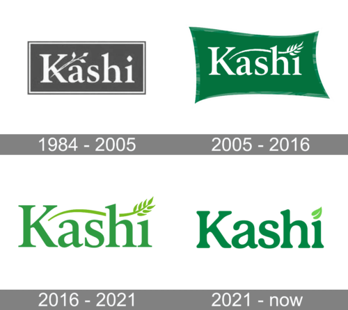
The logo features the name “Kashi” in a stylized, serif font that exudes a grounded and earthy feel, symbolizing its natural food ethos. Above the text, a plant motif with leaves suggests growth, health, and vitality, reinforcing the brand’s connection to wholesome, plant-based nutrition. The use of a monochromatic color scheme imparts a classic, timeless quality, ensuring the logo’s simplicity and focus on the brand’s natural roots.
2005 – 2016
The updated logo radiates freshness, with a vibrant green banner that suggests vitality and growth. The typeface is elegant and modern, reflecting the brand’s progressive approach to health foods. A single wheat sheaf, now more stylized, perches above the ‘i’, evoking the simplicity and purity of the ingredients Kashi is known for. This design speaks to the natural and dynamic essence of the brand, with a color that echoes the sustainable, earth-friendly values at its core.
2016 – 2021
In this iteration, Kashi’s logo adopts a cleaner, more contemporary look with a brighter shade of green, symbolizing renewal and vitality. The font is bolder and more streamlined, reflecting a modern and accessible approach to healthy eating. The wheat sheaf is reimagined as a sprout with leaves, emphasizing growth and the natural cycle of life, aligning with the brand’s focus on organic, life-giving foods. The design’s simplicity and fluid lines suggest a brand in harmony with nature and health.


